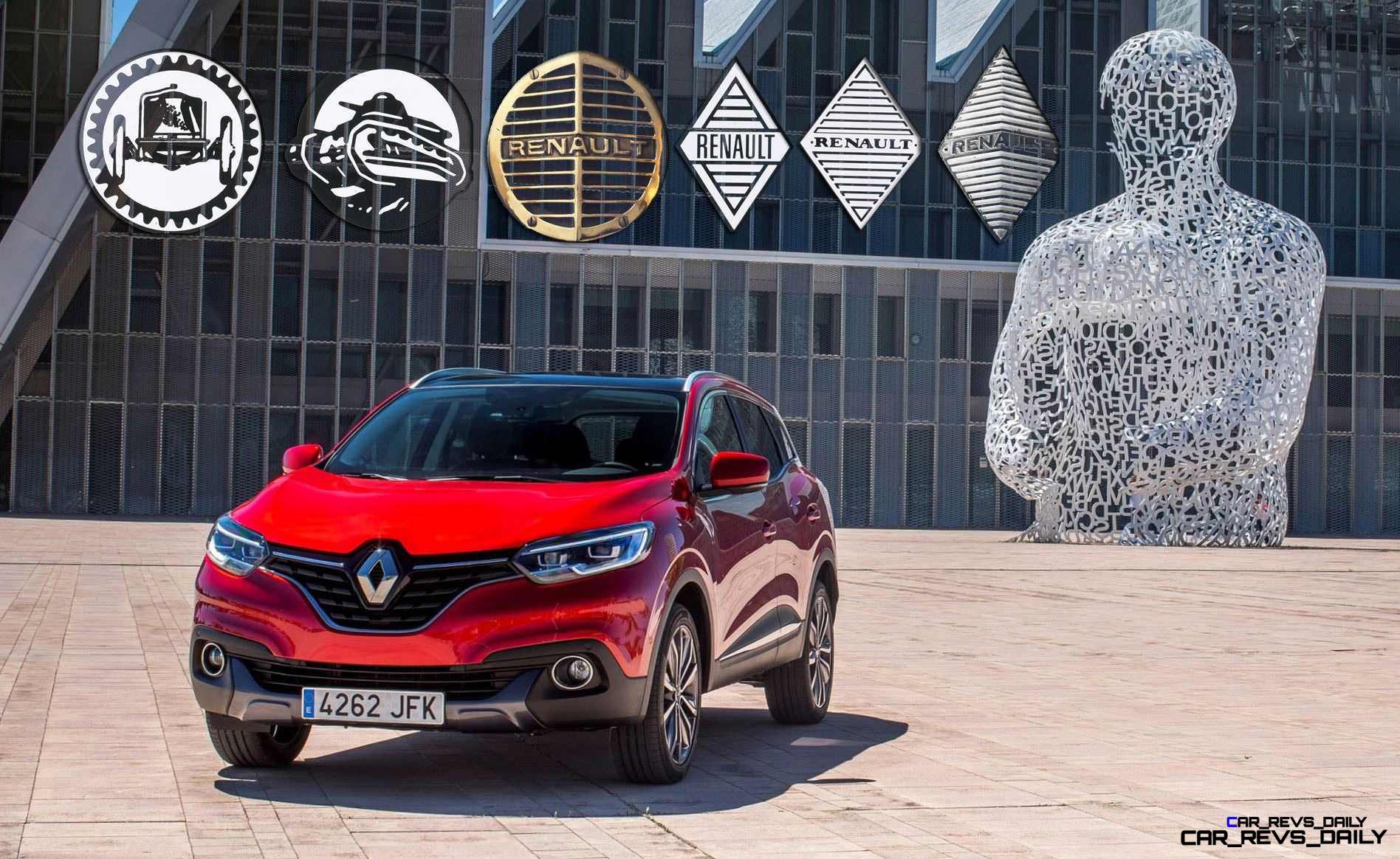
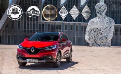
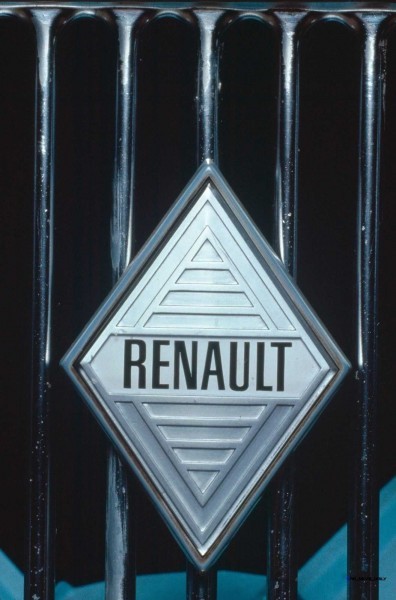
The evolution of a brand’s logo can be fascinating, especially when you see that the icons we all know by heart are actually fairly new creations. The Renault diamond logo is certainly one of the most long-running in history, even though it did not make an appearance on a Renault until 25 years after the company began operations in 1898. The diamond badge replaced a short-lived round emblem from 1923 onward — with its sharper angles better suited to the sharp nose creases of the era’s cars. While not quite as zany as the round badge (that was actually the horn!), the Renault diamond logo has enjoyed much more timeless appeal.
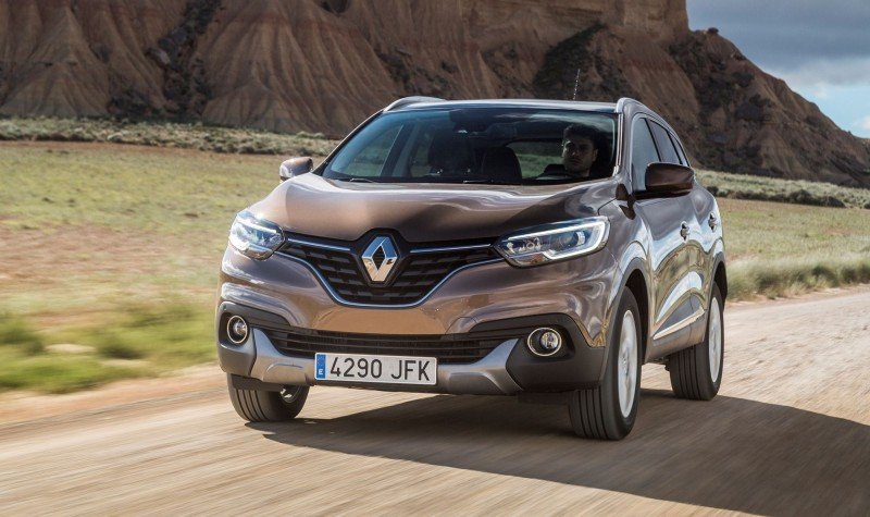
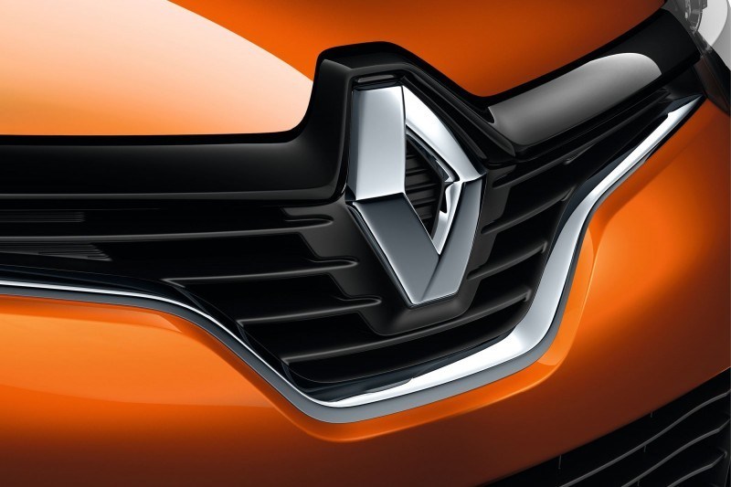
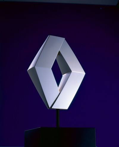
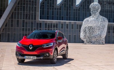
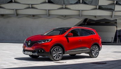
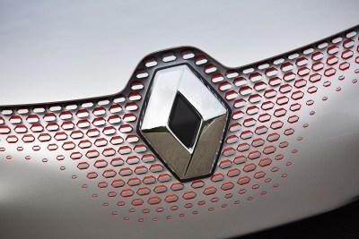
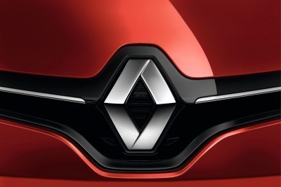
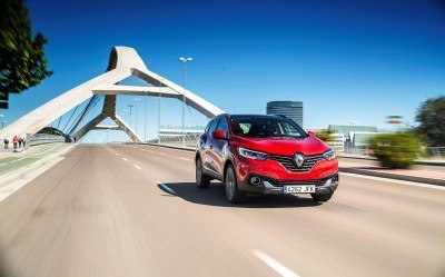
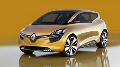
Many refreshes over the last century stuck with the same general appearance, but became progressively larger, blockier and more three-dimensional. The 2015 logo update on Renault’s new Kadjar and Espace follow this general theme: the new emblem is larger, slightly more organic and shows a bit more smoothness than the sharp cuts of the 1990s badge.
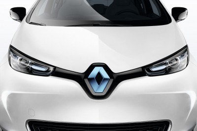
The original purpose of the diamond shape — keeping form even if it is mounted with a pinch on a its vertical axis — also evolves for 2015. The new crease and pinch runs along the horizontal axis more than ever. This lets the nose badges be vertical for the bottom half of the badge, but tilt up and into the hood for the top half.
The new noses are basically designed as a showpiece for the iconic emblem, as seen on the latest models with a swish of gloss black grille enveloping the diamond, which stands up and proud of the grille surface. The new badge can now morph to match the design needs of future Renault noses. See how the Zoe emblem must be stuck on at a raked angle? If redesigned today, the badge would be vertical for its lower part, and tilted into the hood for the upper section.
That being said… it is a subtle tweak.
One of the clearest ways to see how flashy the nose badge is for 2015 and beyond is to compare one car’s nose and tail. Although still deeply 3D, the trunk badges skip the adaptive ‘pinch’ of the nose crests.
It is a clean revamp and one that stays recognizable for Renault in 2015. The new badge comes with a corporate sync-up too: the emblem on the 2015 Kadjar is now the Renault Group logo too. The typeface for Renault goes sans-serif for 2015, too. A fresh font and new cheesy slogan live in modern, all-caps letters with a rounded flourish.
Dropping the unique letterhead styling of the Renault name seems like a more perilous move than the logo. The most iconic in our eyes is the 1990s style, as seen in a few flashback pics.
Old Logo/Font
New 2015 Logo/Font
Renault Emblem Evolution – 117 Years Crowned with Fresh 2015 Motif
AUGUST 24TH 2015
RENAULT LOGO HISTORY: 117 years of brand identity
Calender of Renault EOLAB – © MEUNIER, Denis
In 2015, Renault has deployed a new brand universe. At this occasion, we decided to look back at 117 years of logos and brand identity that have changed the company with its times.
- A logo is a key component of corporate identity. When somebody talks about the ‘diamond brand’, you know immediately that they mean Renault. For the past 90 years, the brand identity has been summed up by the letters in the name ‘Renault’ and by the diamond-shaped logo.
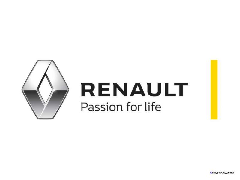
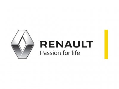
- Since April 2015, Renault is renewing its brand identity with a new logo and a new brand signature reflecting the thinking behind its products: RENAULT – Passion for life*.
(*): In France, the brand signature is « RENAULT – La vie, avec passion ».
1898: Birth of a company
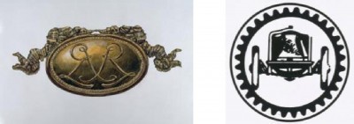
Renault was founded in 1898 by the three brothers Louis, Marcel and Fernand Renault. The company was initially called “Renault-Frères” and the first logo in 1900 featured the brother’s initials, with two entwined Rs in an “Art Nouveau” medallion. Used primarily on internal documents, this emblem was not used on brand vehicles, which could be recognized only by the name “Renault-Frères” on the running board and the initials LR (for Louis Renault) carved onto the wheel hubs.
Logo 1900 – © Renault Communication − All rights reserved Logo 1906 – © Renault Communication − All rights reserved
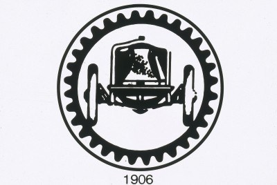
In 1906, the medallion was replaced by an image of the Renault that won the first French Grand Prix, shown inside a gear wheel. On becoming the sole manager of the company, Louis Renault changed the name from “Renault-Frères” to “Société des Automobiles Renault” in 1910. At the end of the First World War, due to its contribution to the Allied victory by producing FT17 tanks, Renault modified its logo to feature this celebrated armoured vehicle. In 1922, Louis Renault changed again the name of its company to “Société Anonyme des Usines Renault”.
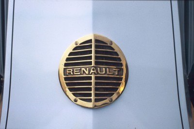
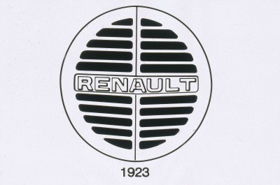
In 1923, Renault decided for the first time to place a front-end logo on its vehicles to make them more easily identifiable. It adopted a round grille with the name of Renault in the centre. This logo was both functional and essential since behind the grille at the front of the bonnet was… the horn! Regulations required this function to be positioned at the front behind a metal grille. Tailored to the specific snout shape of Renault’s “Alligator” bonnet, the logo was split in two by a central line.
Logo 1923 – © Renault Communication − All rights reserved
1925: The adoption of the diamond
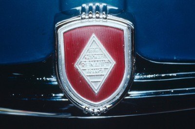
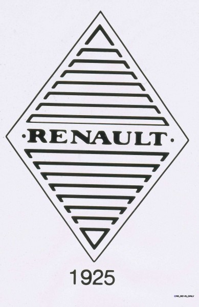
The round logo of 1923 soon gained more angular contours, better suited to the dihedral-shaped bonnets with their two plane faces and central dividing line. The diamond was used alongside the round grille from 1924, appearing on the front of the 40-CV Type NM executive tourer. This geometrical symbol was definitively adopted in 1925. In the first instance, the diamond was used exclusively on luxury sports vehicles identified by the name Stella from 1929.
Logo 1925 – © Renault Communication − All rights reserved Logo 1936 – © Renault Communication − All rights reserved
Over the 1930s, the identity evolved gradually and was progressively adopted across the company. During this period, the company also gained a famous brand signature: “Renault, l’Automobile de France” (“Renault, The Automobile of France”).
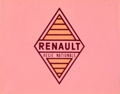
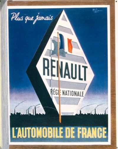
The nationalization of Renault on January 16, 1945 marked a change in status. The company became the Régie Nationale des Usines Renault. The name “Renault” was used as the commercial brand. The brand signature evolved to become: “Plus que jamais, Renault, l’Automobile de France” (“More than ever, Renault, the Automobile of France”). From 1946, these changes were also reflected in the diamond logo, which was published in colour for the first time on official documents. Yellow became the emblematic colour of the brand.
© PINEAU, M. Logo 1946 – © Renault Communication – All rights reserved
Logo 1959 – © Renault Communication − All rights reserved
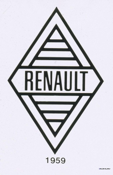
The diamond became indissociable from Renault and was included in all documents and adverts. In 1959, from the Renault 4, the cars and the sales network began to use a new, narrower logo called the Pointe de
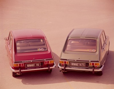
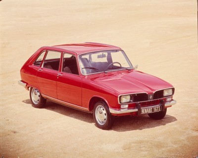
Diamant or diamond tip. The emblem still included the name “Renault” etched in slimmer lettering but the words “Régie Nationale” disappeared. Positioned in some cases on the right of the asymmetric grille (as on the Renault 8, for example), the logo was also used as a decorative feature on the body sides (particularly on the rear wings of the Renault 16). On internal documents, the black-and-white logo always had a yellow background.
1972: The famous Vasarely diamond
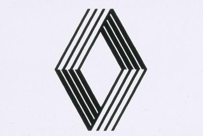
To further underline the strength of the diamond, the company decided in 1972 to make it wider with cleaner lines. The diamond became more prominent and the name of Renault was no longer included. The company decided to bring into play its Art & Industry policy, set up in 1967, with contributors including painter and visual artist Victor Vasarely. Working with his son Yvaral, the founder of op art created a logo based on parallel lines. The result was both simple and intricate, high-tech and visually attractive. The
Renault 5 became the first model to feature the “new diamond”.
© Renault Communication – All rights reserved, Yvaral and Vasarely, 1972
Since 1963, Renault asked the agency Publicis to create its advertising campaigns. In 1985, this agency came up with one of the company’s most emblematic signatures: “Renault, Des Voitures à Vivre” (“Renault, cars for living”).
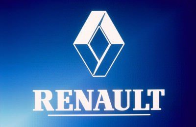
Twenty years after the Vasarely logo, Renault decided to review its visual identity to express the quality standards embodied by the brand. The 1992 logo was equally elegant but simpler and stronger with its 3D relief. It was an emblem suggesting the quality and robust strength of brand products. Renault’s name also appeared under the diamond in each document or advert.
Logo 1992 – © PONS, Philippe Logo 1992 – © PONS, Philippe
In 2000, the brand adopted the brand signature “Créateur d’Automobiles” (“Creator of Automobiles”) and updated its visual identity, placing the diamond symbol inside a yellow square to bring out its relief and substance in 2004. Three years later, the international signature became “RENAULT – Drive the Change”, heralding Renault’s innovation in new territories with the arrival of the electric vehicle range.
Calander of Renault CAPTUR – © Renault Marketing 3D−Commerce
Renault has a long tradition of designing innovative, ingenious and practical cars ever since the company’s origins. Since 2012, this integral part of the brand’s DNA has combined with a determination to engage with its customers in a more emotional way as well. This called for a revitalised approach to vehicle design and the tangible signs of this commitment today are the warm, sensual and appealing lines of the CLIO, CAPTUR, TWINGO, and now with the launch of KADJAR and of the New ESPACE. All of these latest models feature a stronger visual identity with a verticalized and large diamond logo, which takes up a fundamental and dominant position on the grille, giving the vehicles new allure, and making them immediately identifiable as Renault models.
With the renewal of the range well underway, Renault has chosen this moment to launch a new Brand signature, ‘RENAULT – Passion for life’. This signature encapsuates the obsession of its engineers and design teams to observe customers daily lives – and to satisfy them with cars that make their lives better every day.
Renault’s latest line-up is designed to look and feel great – and exude quality in every detail. The latest Espace demonstrates this with its new crossover design, exquisitely-finished interior and adaptable Multi-Sense® system, to make driving every day a real pleasure. The latest Renaults continue the tradition of offering ingenious innovations that enrich customers’ lives, like the rear-engine layout of new Twingo which makes city driving easy and fun, with its best-in-class turning cycle. Indeed, all of Renault’s cars, features and services are designed to make life easy – from the the Captur’s washable seat covers, the Kadjar’s automatic folding seats to the latest R-LINK2® multimedia system, both practical and intuitive.
At the same time as the new brand signature, Renault’s Corporate Design Department has carried out a review of the brand’s graphic identity. The Renault diamond has been made bolder and has been freed from the confinement of its surrounding outline – it now shared the attributes of the generous, higher-status, brighter logo that adorns the front of the brand’s latest models.
The brand-block has changed, as well. Although its draws its DNA from Renault’s past, it stands out as more modern and more assertive. It features a new, specially developed typeface designed to add a distinctive touch to the brand’s communication. The Renault yellow, which has been made brighter and warmer, is visible as a vertical strip to the logo’s right. This evolution concerns all the company’s marketing and communication materials – from advertising, both audio and visual (TV, print, posters, radio, etc), to websites, exhibition stands, special events, merchandising, and clothing.
The result is a refined graphic identity that expresses the value of the Renault brand’s products for the years to come.
Logo and brand-block 2015 – © Renault Design New ESPACE – © Publicis
(*): In France, the brand signature is « RENAULT – La vie, avec passion ».

Tom Burkart is the founder and managing editor of Car-Revs-Daily.com, an innovative and rapidly-expanding automotive news magazine.
He holds a Journalism JBA degree from the University of Wisconsin – Madison. Tom currently resides in Charleston, South Carolina with his two amazing dogs, Drake and Tank.
Mr. Burkart is available for all questions and concerns by email Tom(at)car-revs-daily.com.

