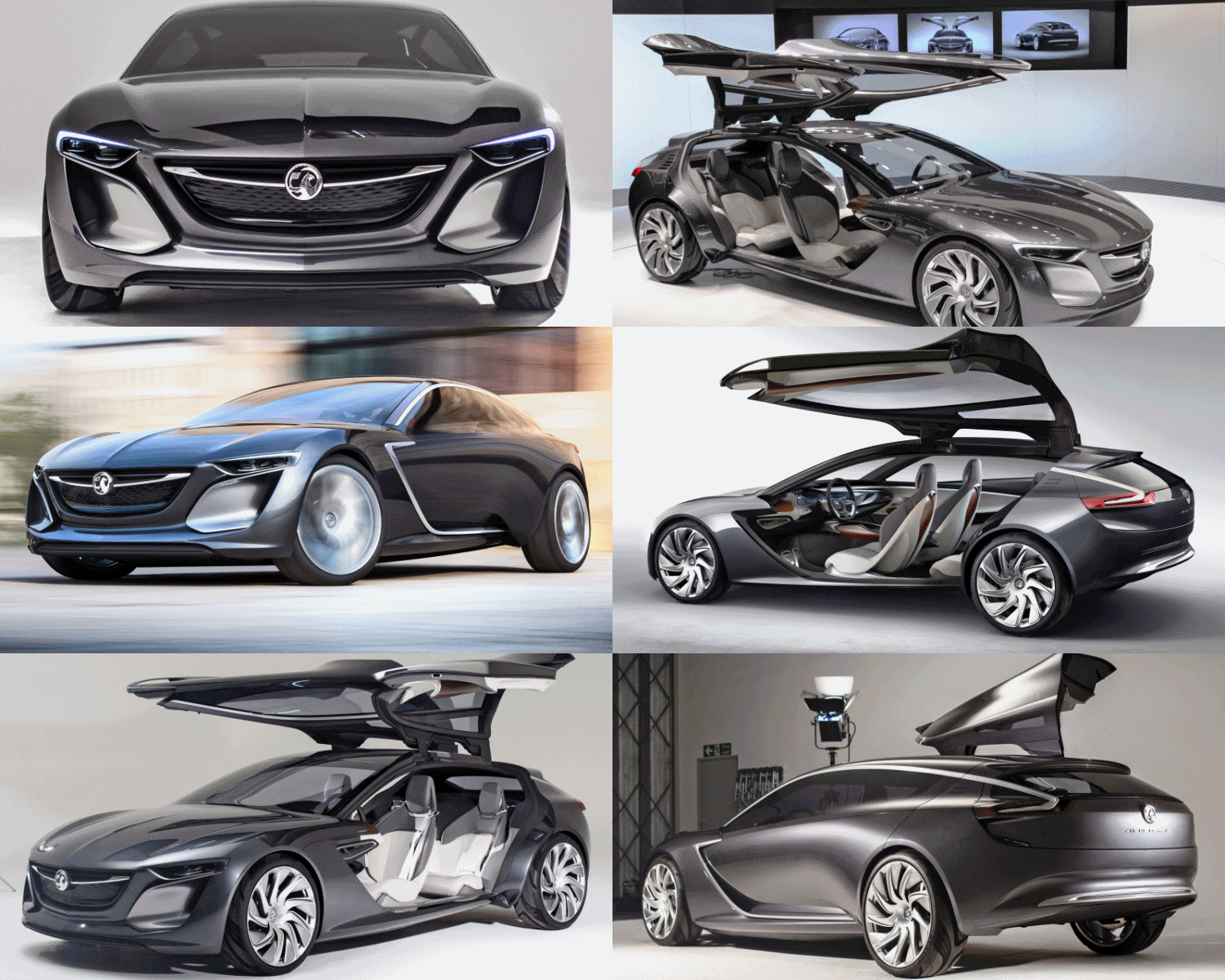
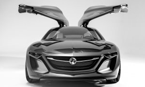
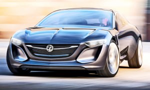
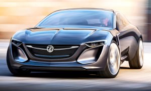
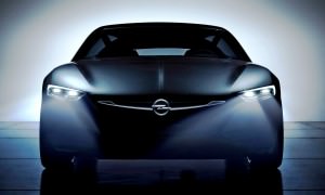
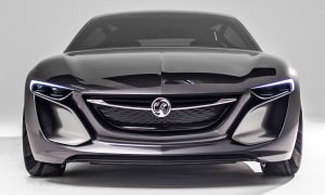
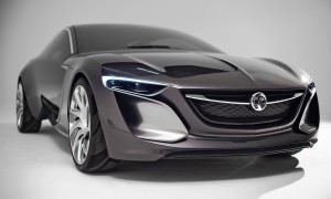
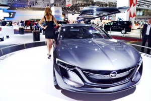
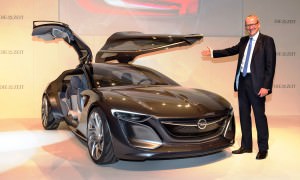
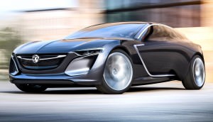
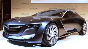
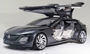
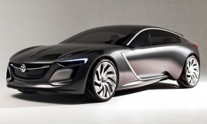
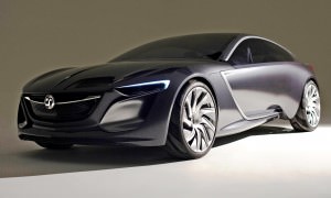
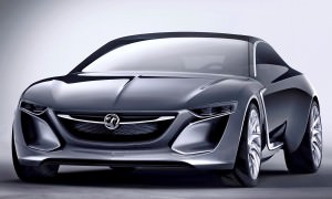
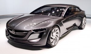
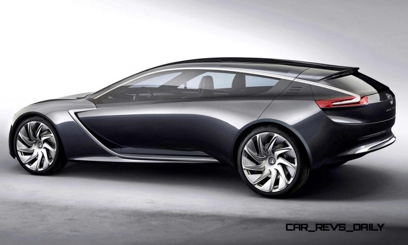
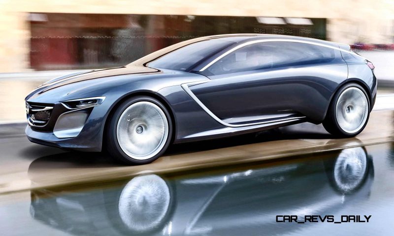
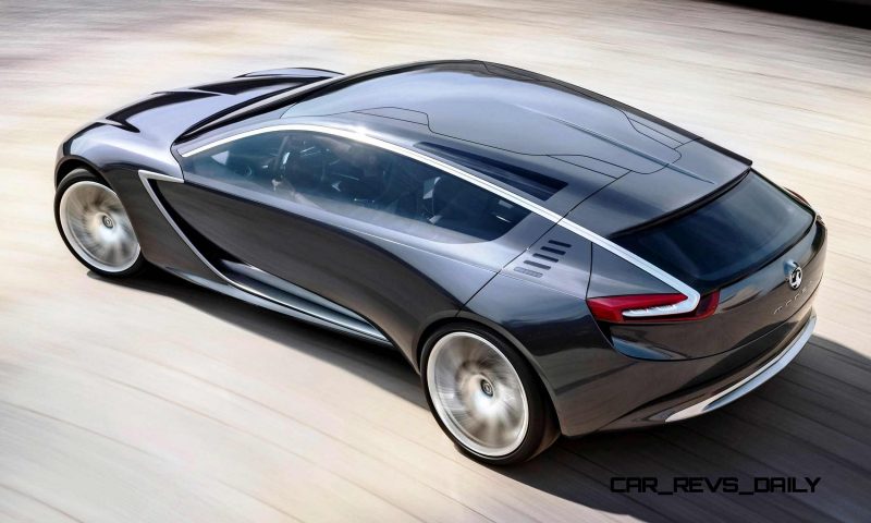
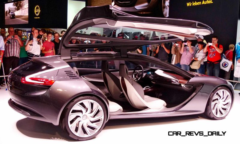
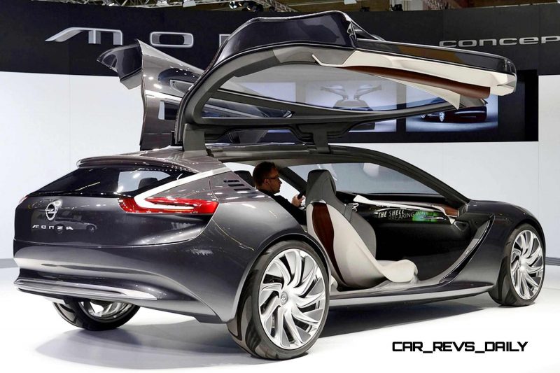
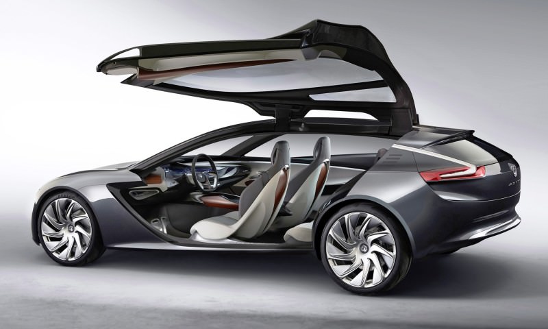
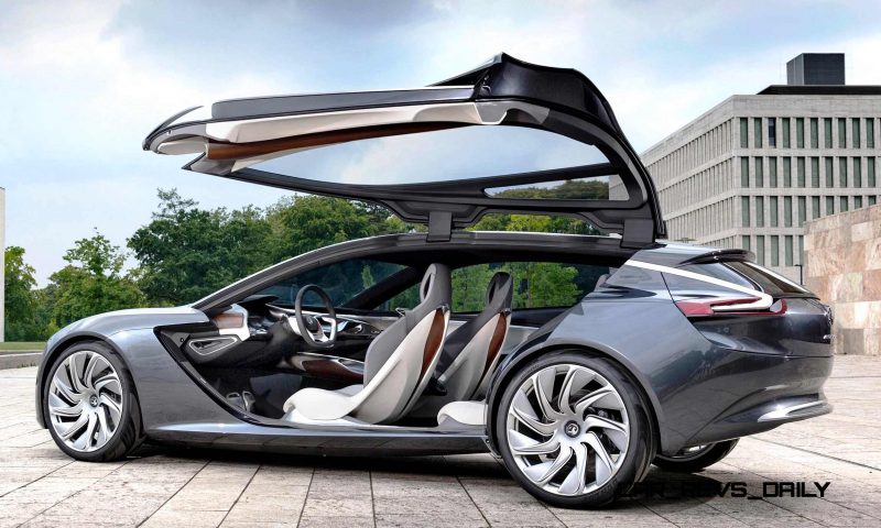
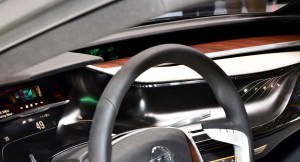
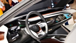
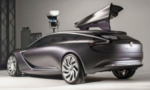
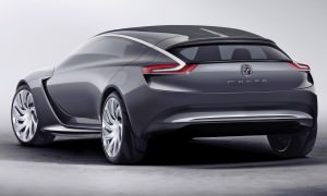
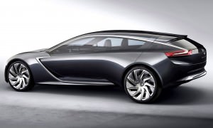
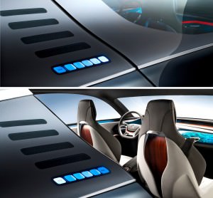
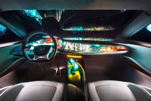
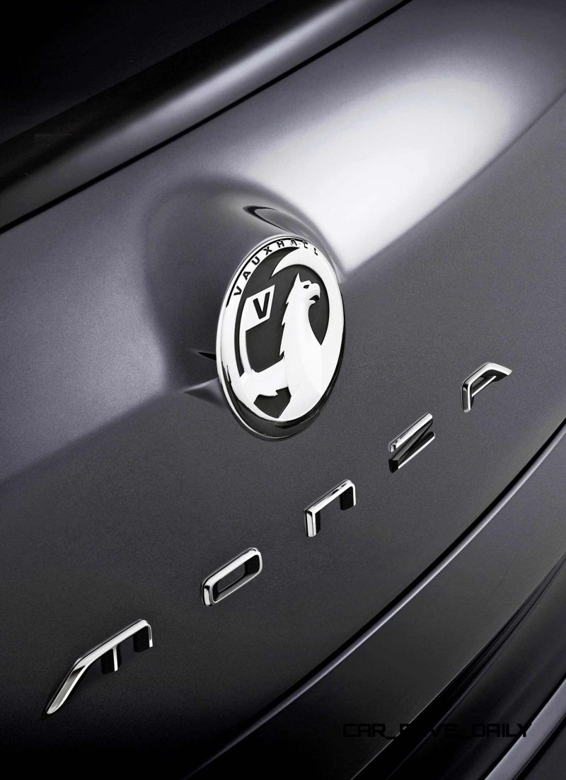
 This Monza concept feels subtle at first. Its slinky and silky metallic gunmetal finishes are the perfect shade of subtle, and let the wild surfaces and flowing silhouette speak for itself.
How to think of this car? A future production model? Not at all. This is perhaps best thought-of as a potential Tesla Model S-fighter, with ambitions to compete with the BMW i8 from a technological perspective. Theoretical pricing would be around $100,000 — so obviously in the fantasy realm for the mid-premium Opel and Vauxhall brands.
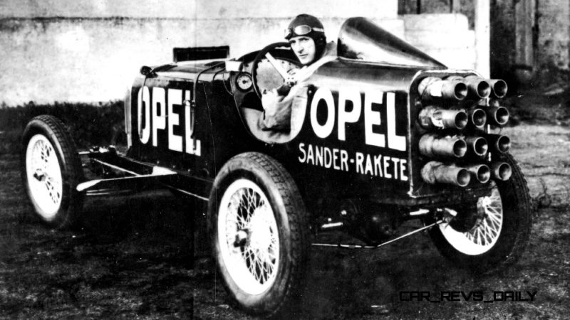
Let’s do a full design assessment by angle. But first! Here is what kind of cool Opel the Monza should aspire to be.
NOSE
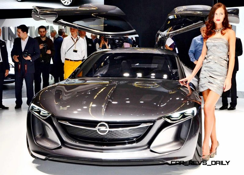
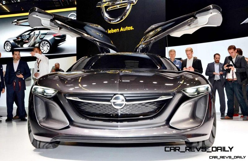
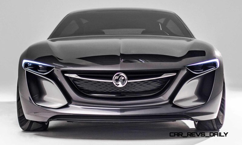
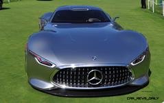
The nose of this design is highly interesting and futuristic, while not requiring much of a big branding statement in the grille to be stylish, premium and glamorous.
The most pronounced change versus current Vauxhall and Opel models is the vertical orientation of the grille, with a defined leading edge of the hood. This, along with the cab-backward proportions, gives the Monza a strong sense of luxury, performance and class. With headlamps in the vertical portion of the nose, the leading edge of that hood can extend all across the nose area and into the fenders and beltline.
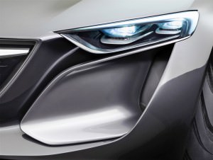
Complete smoothness and organic flow also appears in the lower bumper intakes: with ceramic-feeling oblong saucers in each corner of the nose a defining trait for the overall design. By looking like unique, perfect-fit pieces atop the intake regions, the free-standing aero shrouds are actually integral in a layered nose design.
A layered design is trendy right now, but these are not too derivative of the BMW i8. These are new ideas. By forward-locating these pieces, there also lives a black recess between the duct heads and the deep grille, which is barely half the width of the overall nose graphic.
FRONT THEE-QUARTER ANGLE
From the top edge of these aero intake pieces, a wind-swept look aligns directly with the headlight lower edges, and the line continues up the beltline. The continuous line flows into both the beltline and the glasshouse itself all across the Monza from tip to tail.
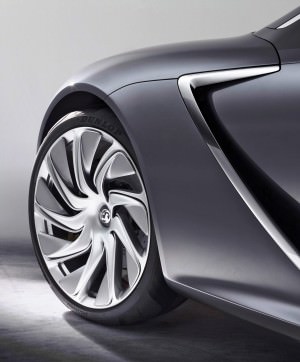
But the most defining element of the front 3/4 angle is easily in the massive check-mark air duct behind the front fenders. Lashed in a silver accent, this giant vent serves three purposes:
— allows the outer fender-back area to match the nose surfacing and overall convex feel of the panel
— releases air from the engine compartment, reduces aerodynamic drag and helps the giant gullwing door to open without and shutlines.
— brings a smooth contrast with the pulled-in shape of the door-front, which feels much more functional in its piercing aerodynamic smoothness.
SIDE PROFILE
In profile, we are dramatically presented with a long-hood, cab-backward style and proportion. The long hood contrasts neatly with over-sized and pulled-glass look of the cabin and luggage compartment.
Overall, this design might work directly on a four-door coupe — or more likely, some type of crossover or SUV.
Down below, we have the second stage of the fascinating door surfacing. This area sucks itself tight to the body, visibly at least five inches inward of the outer fender widths front and rear.
To meet the rear wheel from this in-board swoop, we have a nice aero bulging as the panel shrouds the rear tire area. It looks fantastic, and sexy, with hints of premium luxury and modern technology — like a Porsche Prius, perhaps.
REAR THREE_QUARTER ANGLE
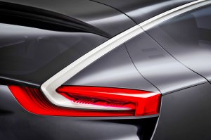
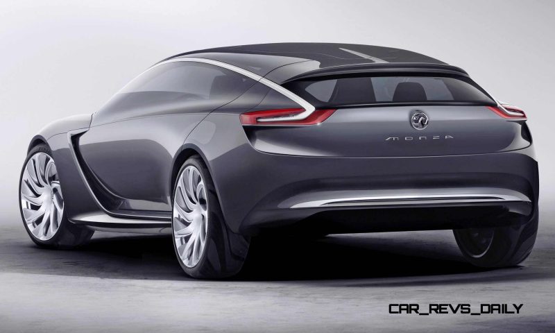
From the rear three-quarter angle, the proportions of the low and lean Monza hit your eyes first. A silver accent piece from the roof flows like water into the rear lamps, which have a type of gutter venting below the lamps.
A steeply sloping and curved rear glass is intriguing, while a giant hatchback shape is over-sized in a way that vaguely recalls the Audi Q5 and Lincoln MKC. In this way, the rear lamps would, theoretically, open with the tailgate piece.
TAIL
From the back, again we get a strong sense of how these designs would feel on an SUV or crossover. A clean group of lower bumper arcs mirrors the overall shape of the hatchback cutline above, while a giant horizontal shoulder is visible above the horizontal taillamps. These rectangles emphasize width, but again feel more SUVish than the low-sling nose and sides.
A nod to practicality in back means the Monza looks like it has a big trunk and even a big back seat, in a nod to practicality of Opel and Vauxhall shoppers.


SUMMARY
Overall, we give the Monza a solid A for unique design ideas that are own-able by Opel/Vauxhall, able to fit a variety of car styles and shapes, and relatively production-feasible.
Tom Burkart is the founder and managing editor of Car-Revs-Daily.com, an innovative and rapidly-expanding automotive news magazine.
He holds a Journalism JBA degree from the University of Wisconsin – Madison. Tom currently resides in Charleston, South Carolina with his two amazing dogs, Drake and Tank.
Mr. Burkart is available for all questions and concerns by email Tom(at)car-revs-daily.com.


