Go Volvo Go!
I love an underdog, and have thrown my continued support behind Volvo since the VCC debuted in Frankfurt in September.
Sidebar: Did I love Volvo before? Yes, as a brand.
But not the cars. Only one year ago — almost exactly — I wrote an op-ed for a defunct media outlet that debated Acura versus Volvo in the battle for the Worst Luxury Brand In America. Scathing barely does that one justice.
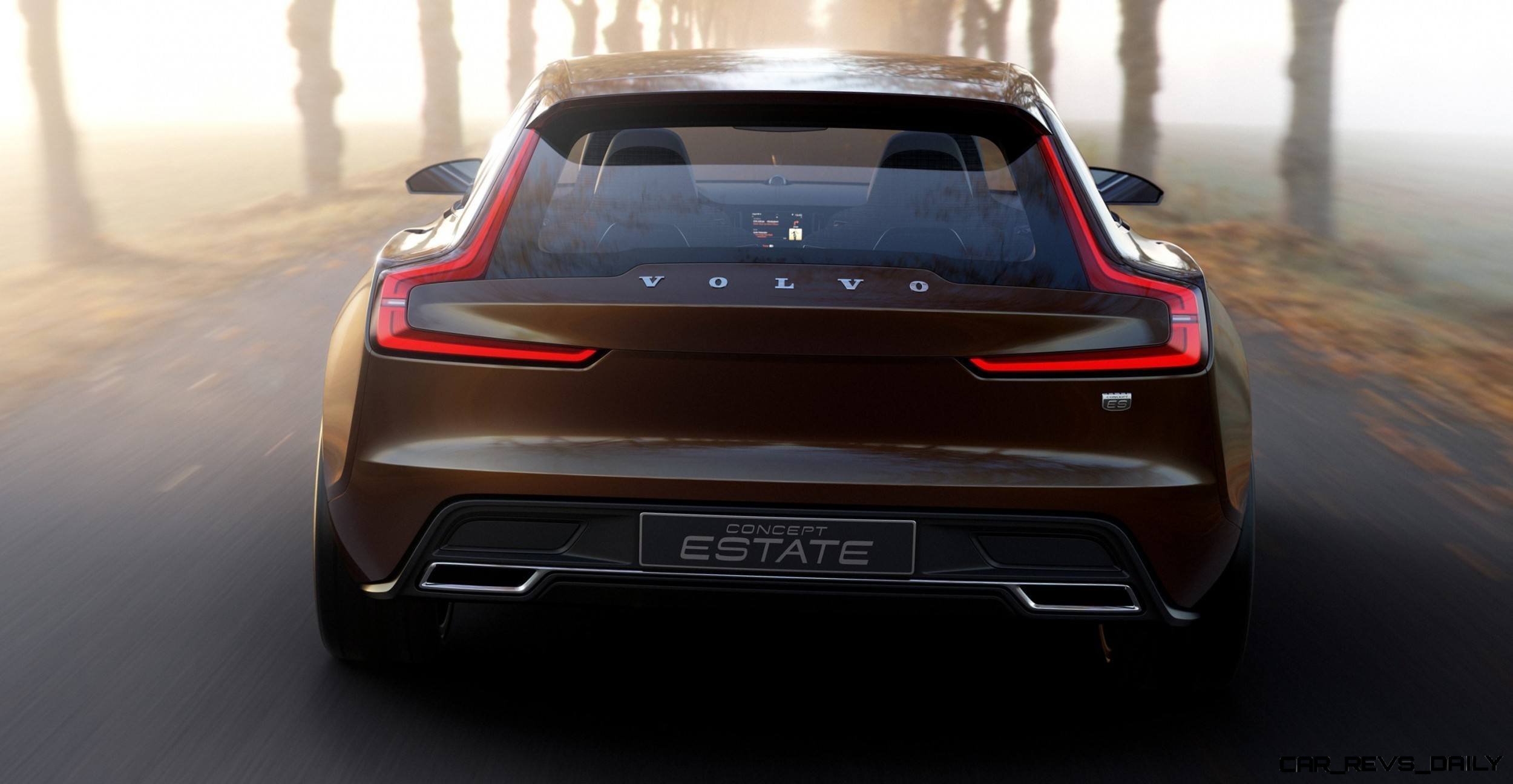
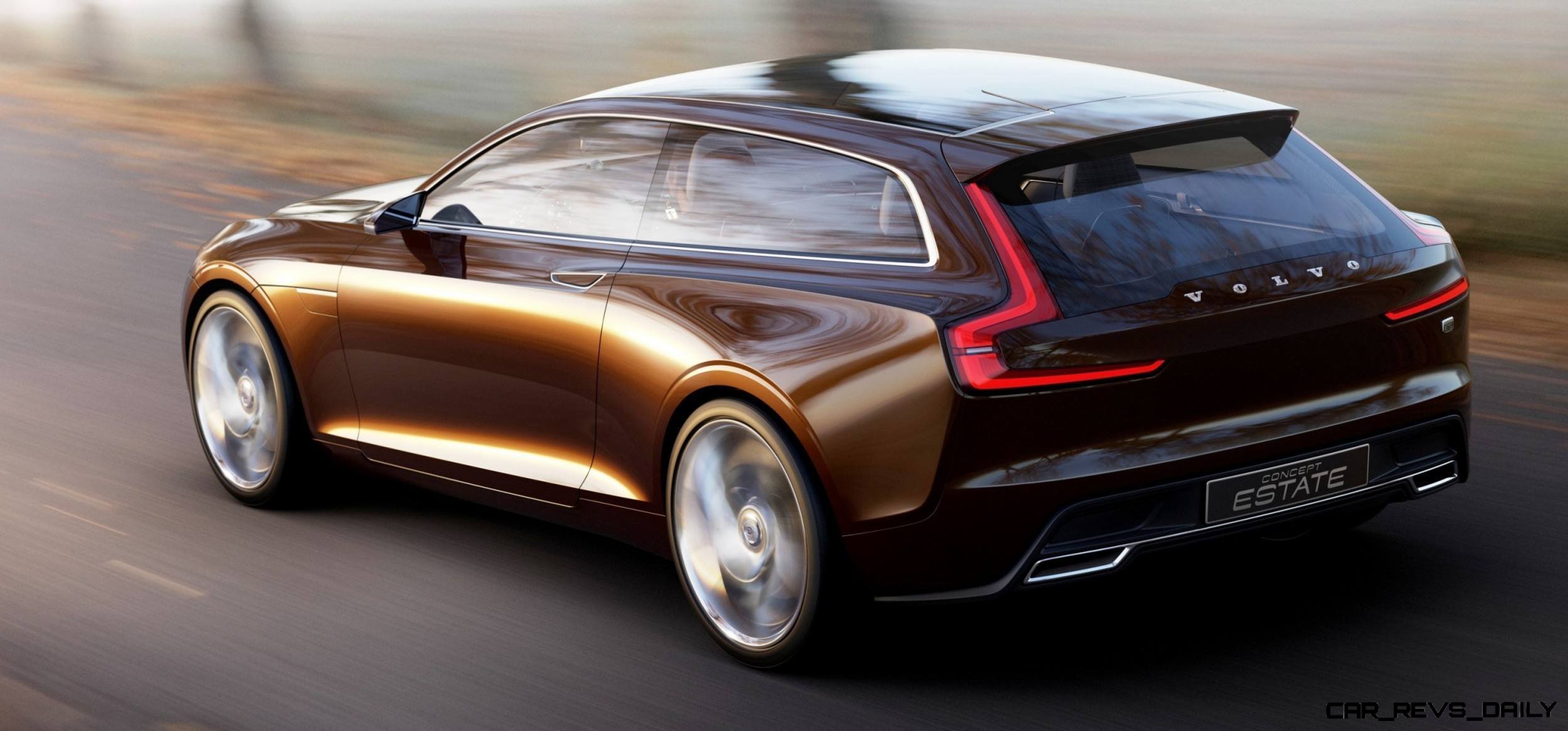
Seeing the Concept Estate makes me glad that article is not still online, and that the original Word doc is long gone as well.
Such an about-face in one year for Volvo is remarkable, and is something to be celebrated.
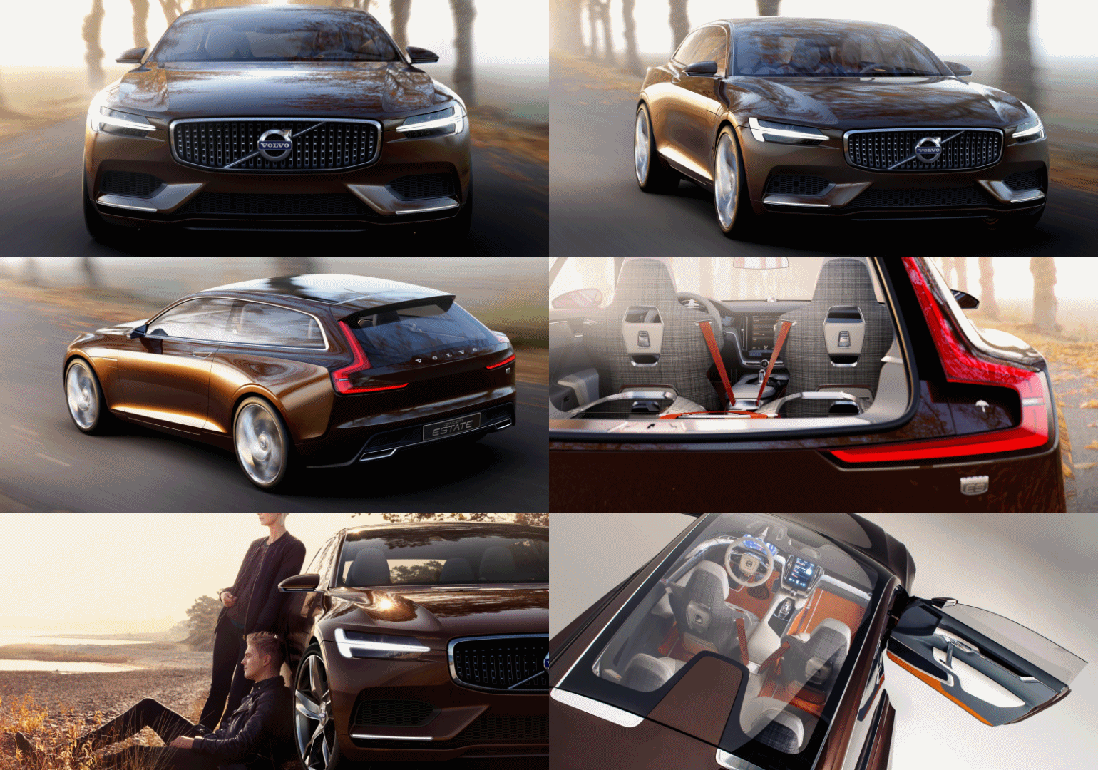
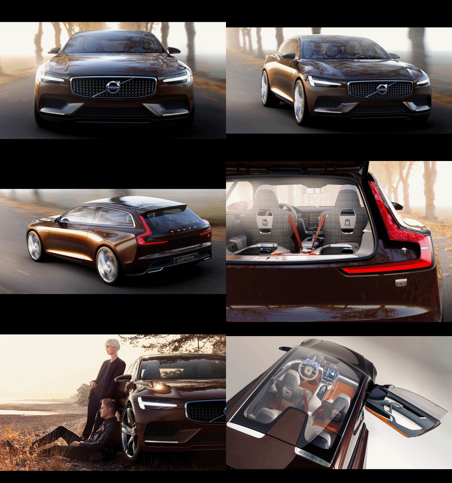
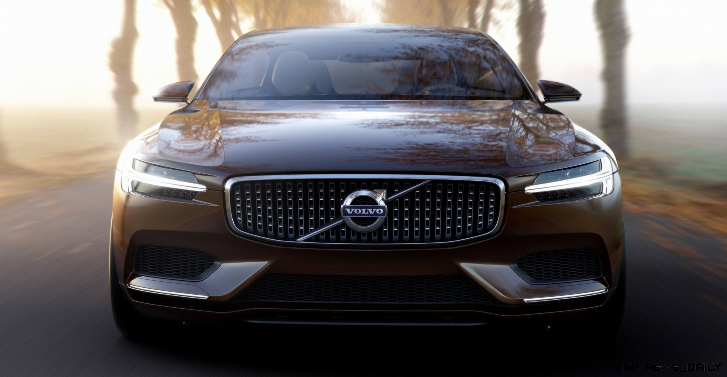
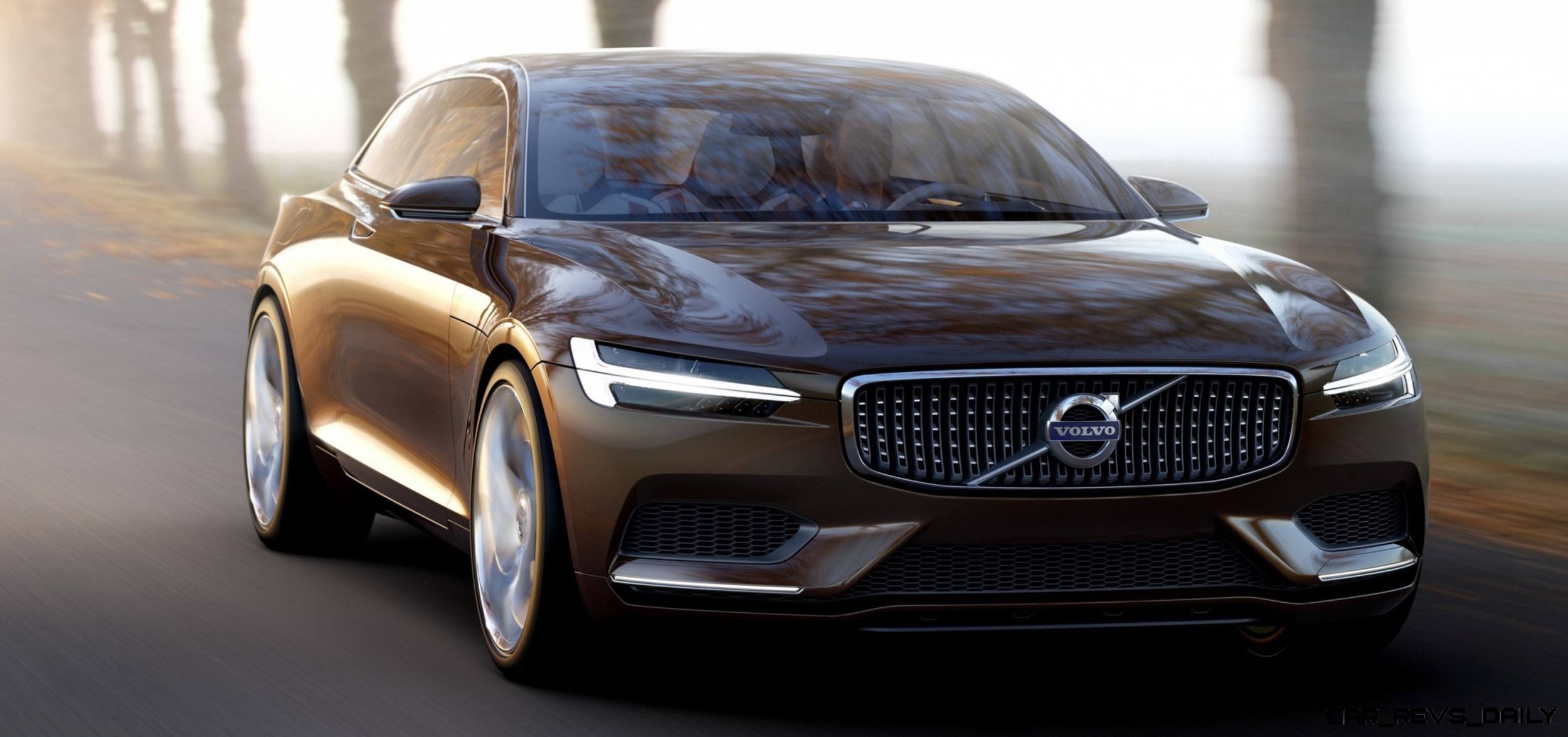
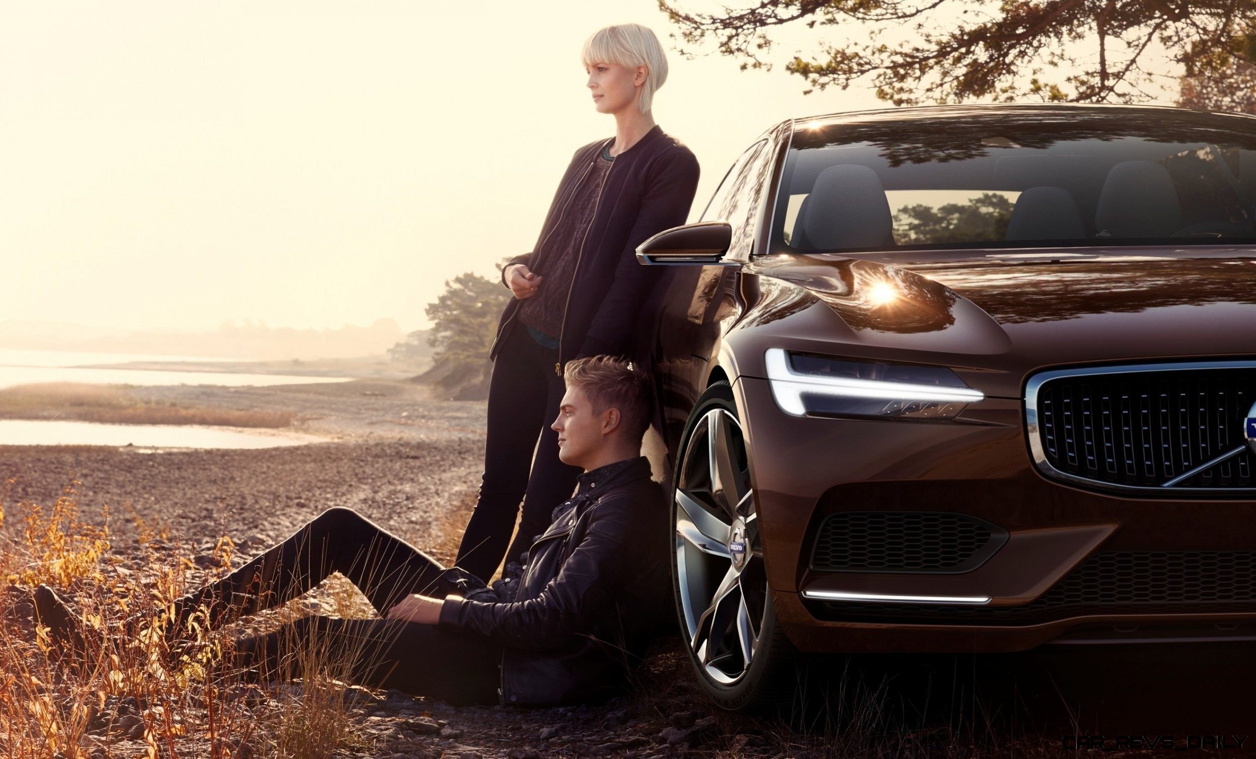
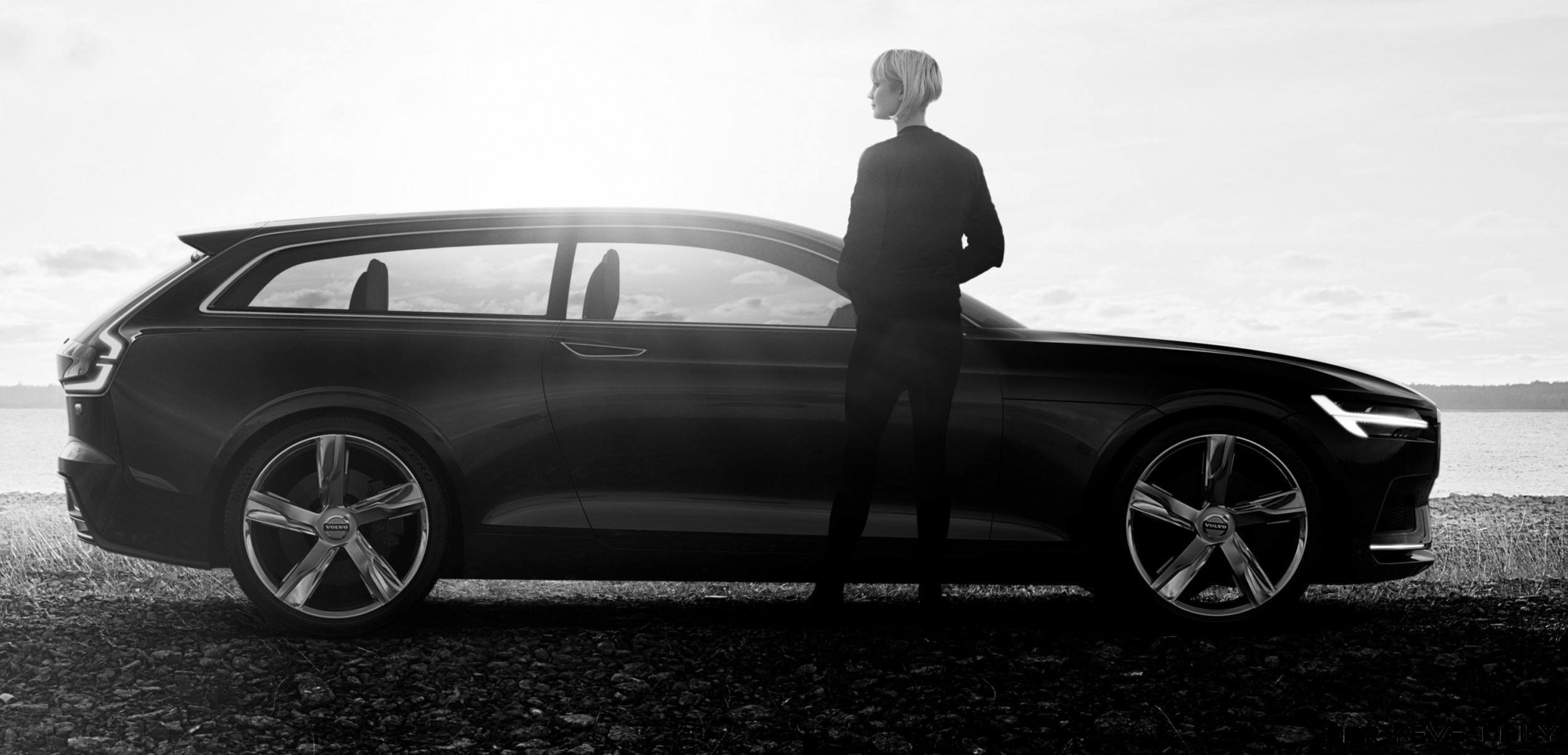
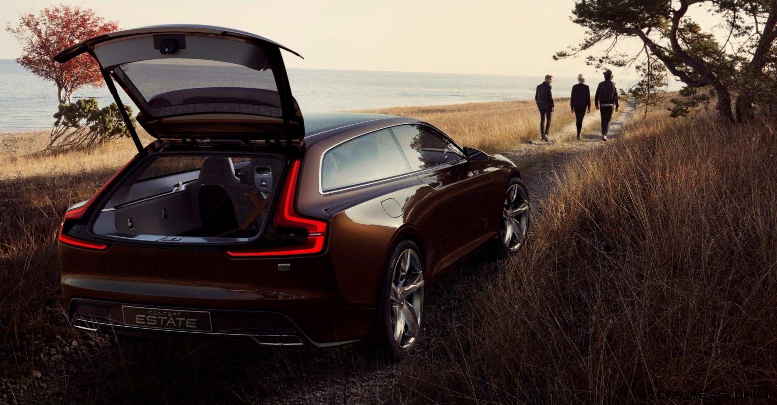
The Volvo Concept Coupe, then the XC Coupe, and now this Concept Estate all serve critical purposes: soliciting feedback via global, real-world focus testing.
Focus groups might come off as a marketing jargon — but they serve really critical purposes.
When I worked on Kraft Foods media business, we spent endless time watching and researching reactions to ideas, tastes and brand names.
But the bite, the taste and the feedback that comes once the Queso Fresco hits the table? Priceless. And often very humorous.
Other Kraft fun with focus groups: Do you know how long it took to take the trans fat out of Oreo cookies? More than 10 years and — I estimate — about $3 billion dollars. You laugh! But it is true. People hatttttteeeeddd the cookies without trans fat. Hated them.
Even shy people are remarkably honest and forthcoming about taste, sight, smell and other sensory reactions.
Best of all: there will be dozens of answers and feedback that no all-day Integrated Marketing Communications meetings could ever tease out.
The most critical part of our prototype Queso Fresco testing (which lasted for eight months and as many formulations) while we created the media program to support its rollout?
Consumers hated it. They preferred the traditional Mexican brand of this crumbly white goat cheese.
All the biggest cheesehead scientists at Kraft could not top — let alone match — the “other guy” in double-blind taste testing.
When the brand name was brought in, Kraft’s performance was so poor in those tiny conference rooms… that only one decision was possible: Cancel Kraft Queso Fresco before it ever launched.
Why spend millions, hundreds of millions, ramping up the cheese production line and cutting ad agency checks when consumers just hate the product.
Plain and simple: the Queso Fresco market was owned by one small firm for good reason. Theirs tasted better.
What is the point of this?
Volvo tried very, very hard to get everyone on-board with the naughty S60 in 2009. It tried again to lure us in 2010. But sales were low and sinking fast.
But consumers overwhelmingly shrugged and sighed. Peter Horbury’s designs simply were not resonating with American car buyers.
Step in: Mr. Thomas Ingenlath, a tall Swede who —– we are speculating here! — might have had some English-speaking ancestors.
His vision is broad, exciting and coming true with these three magnificent concept cars.
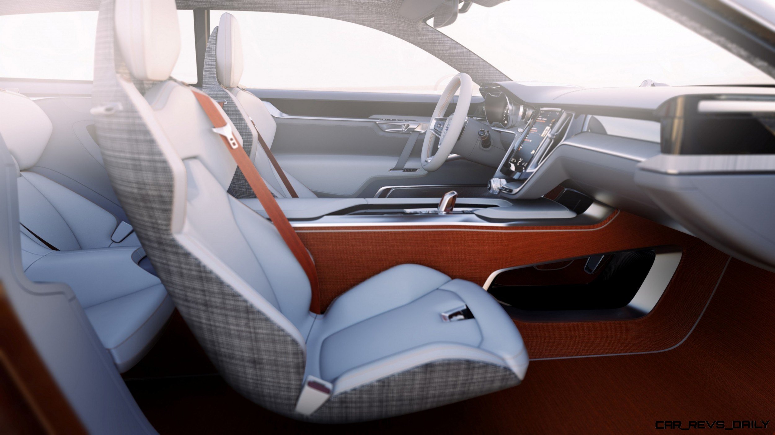
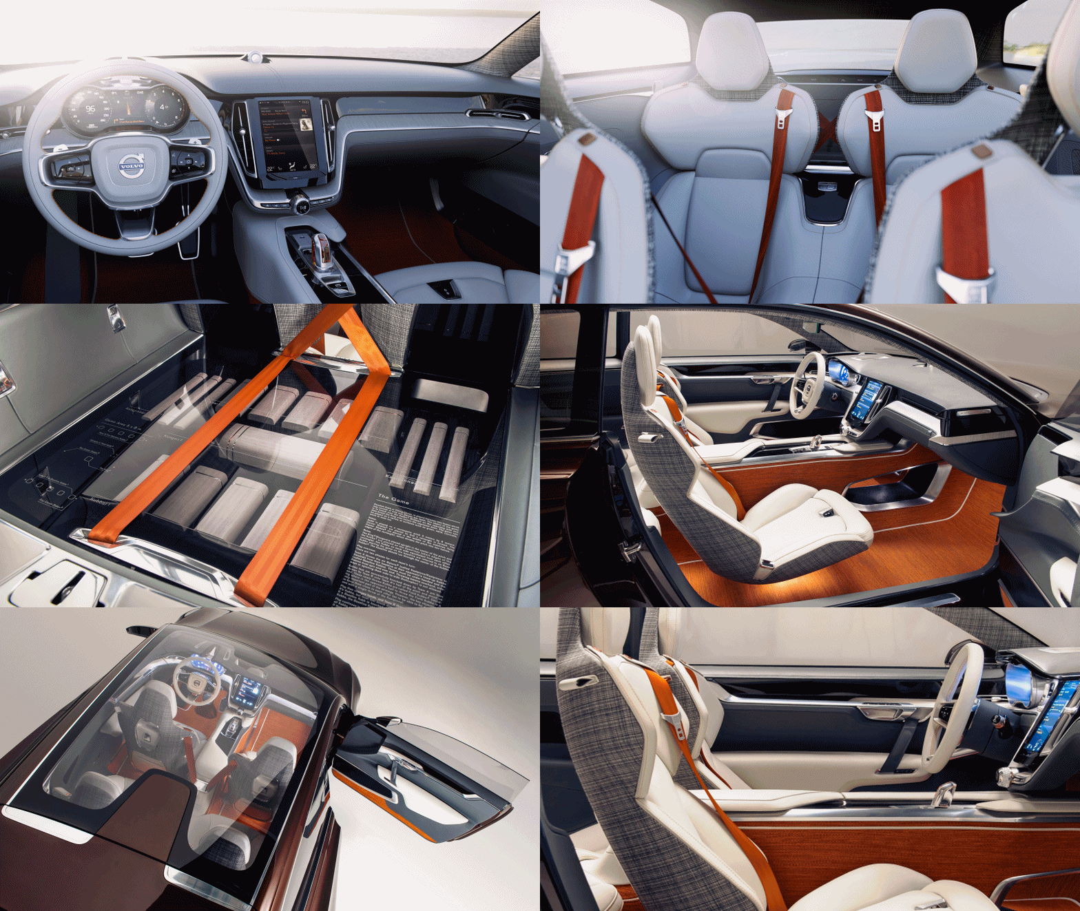
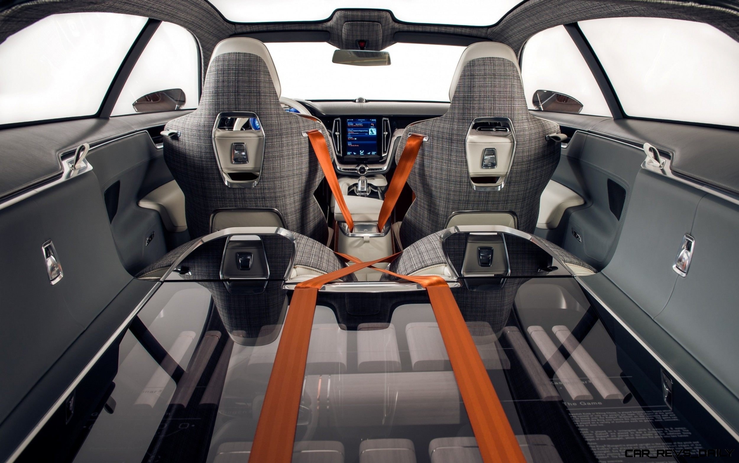
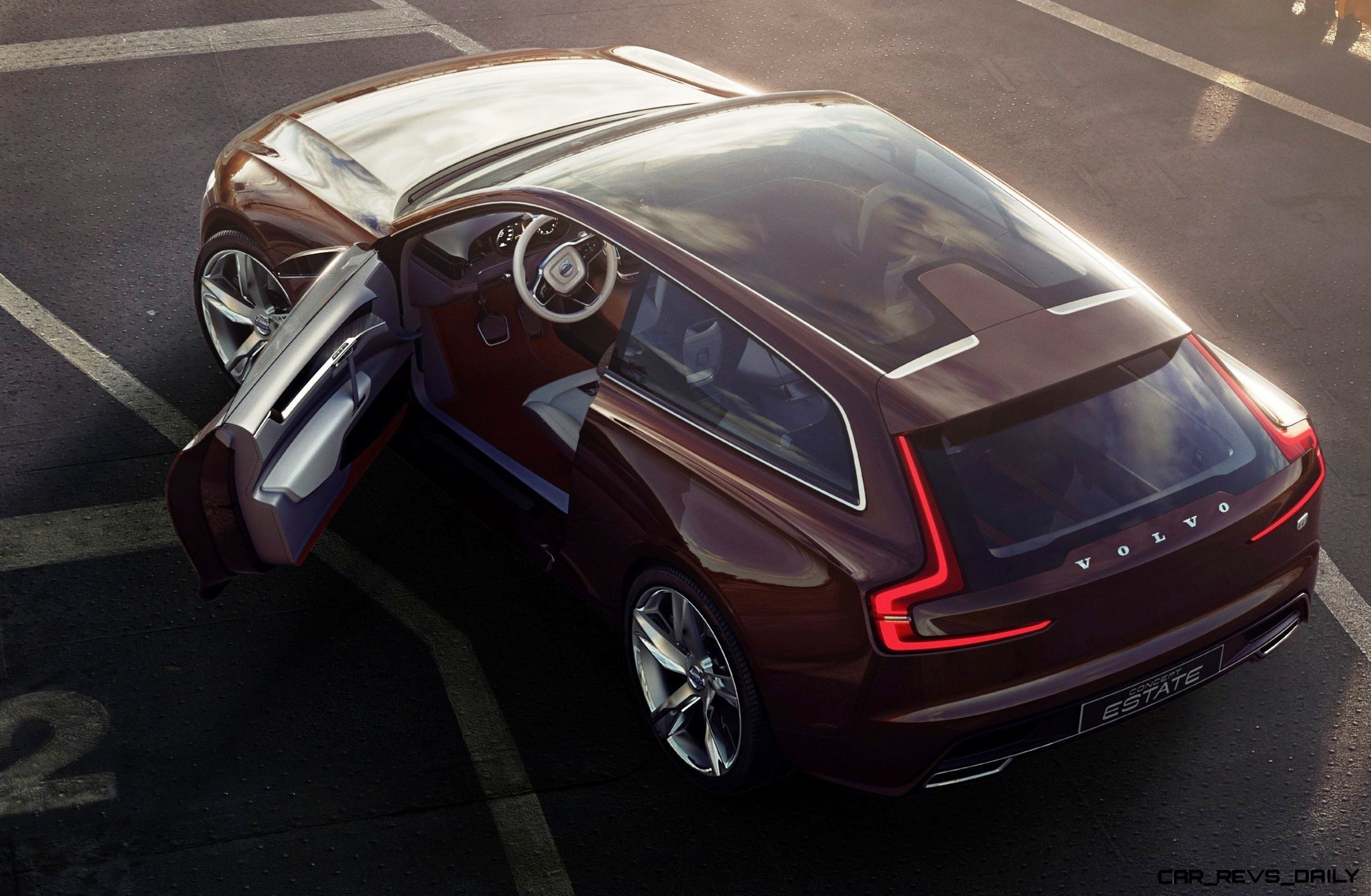
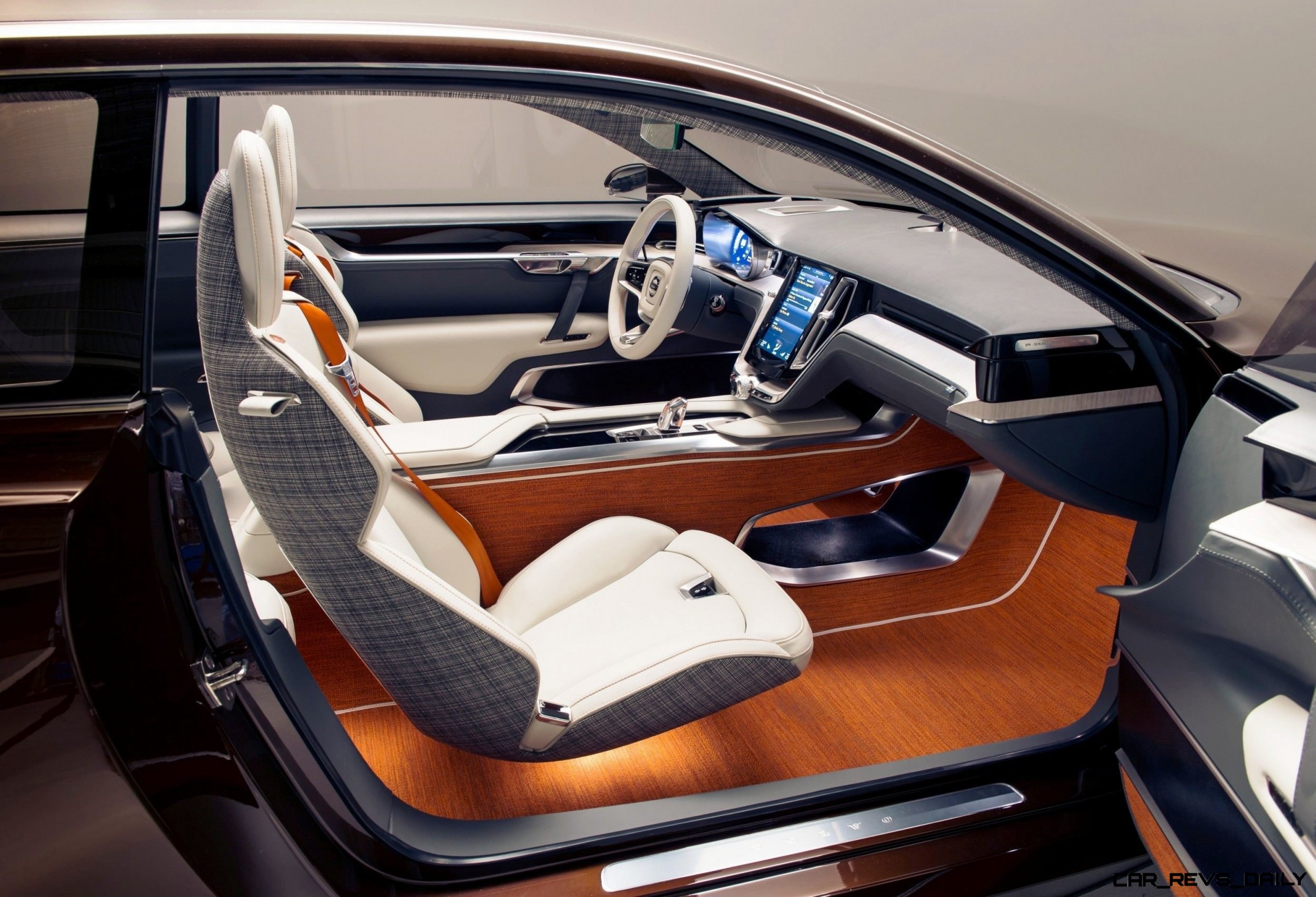
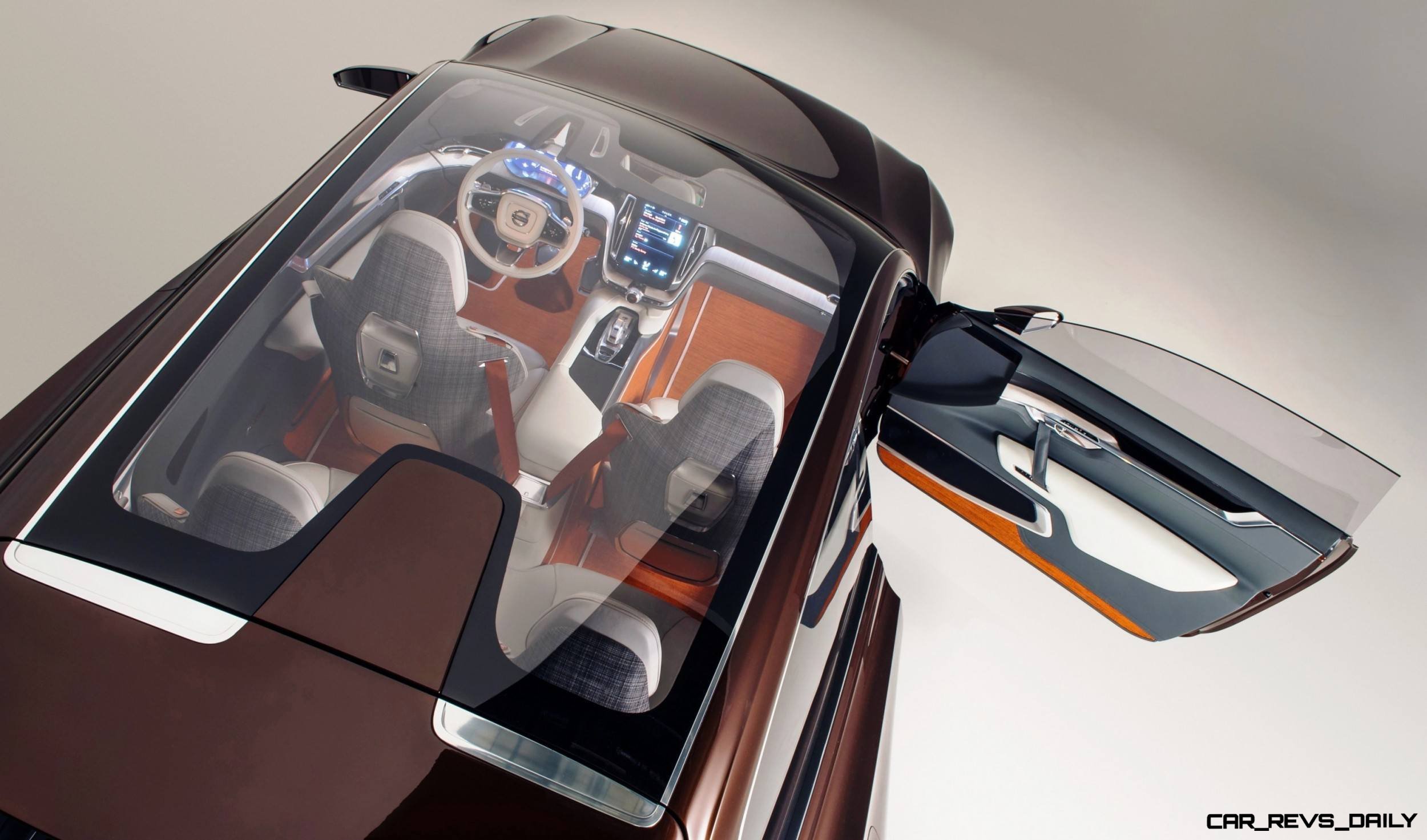
Even better, the successful reception of the VCC and XC Coupe have emboldened the team to step it up on the interior of the Concept Estate.
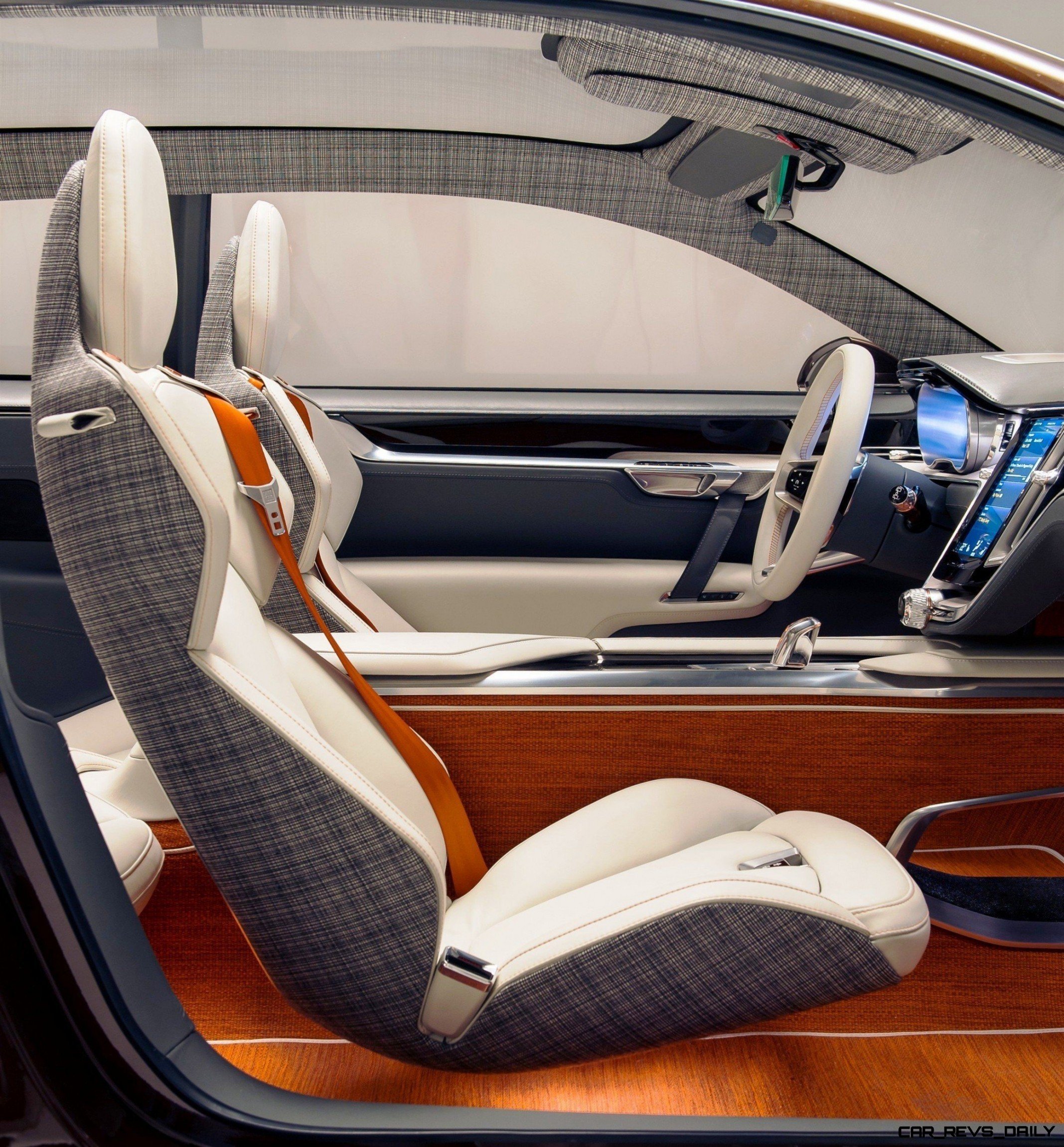
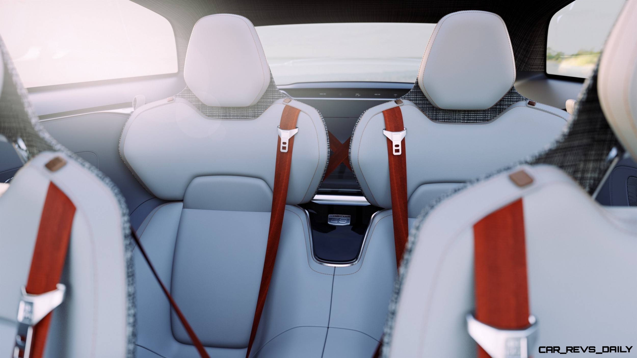
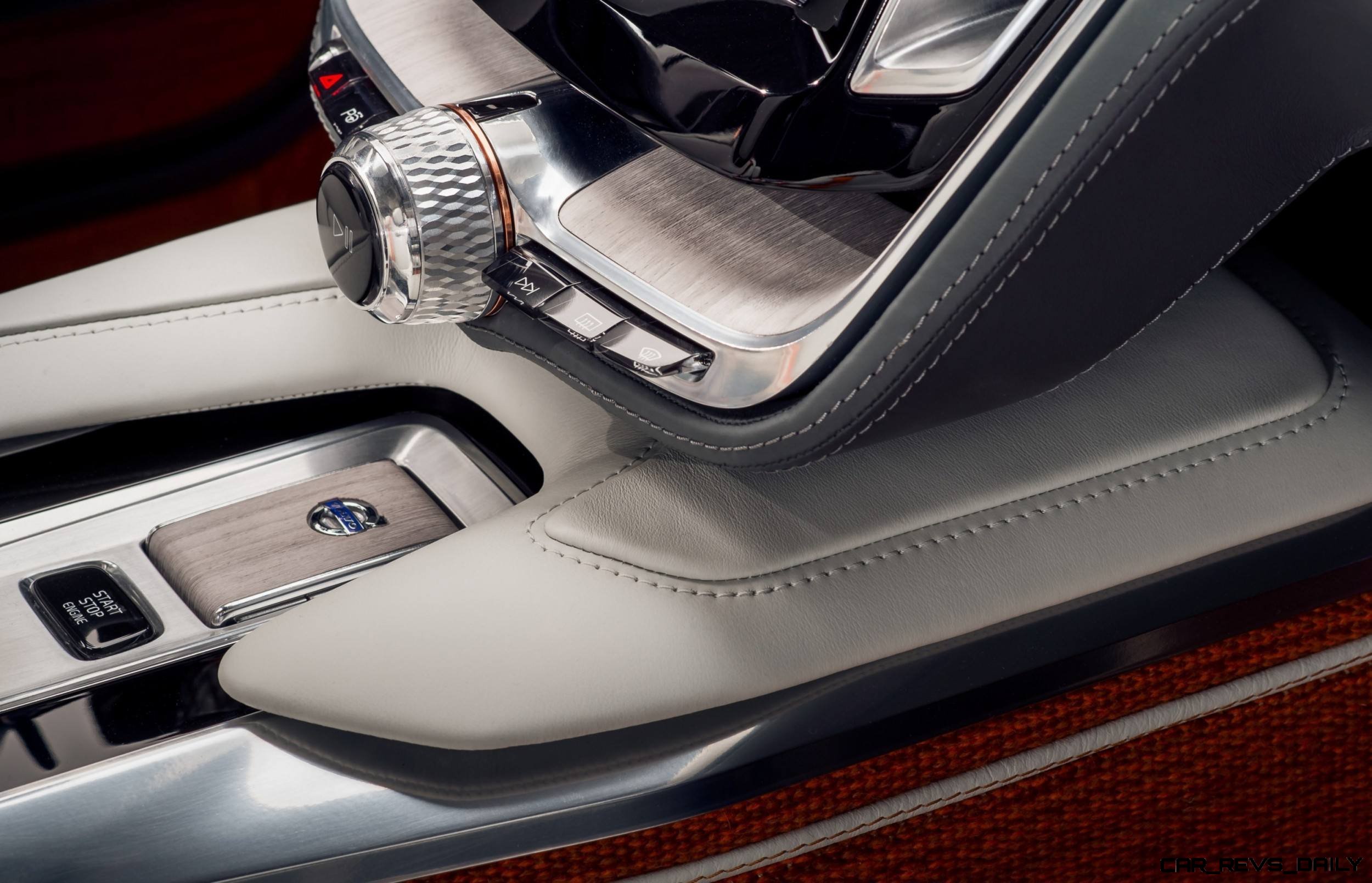
Woven wool rugs and headlining, Bridge of Weir leathers, a center console like a party yacht’s center coolers — this is a man with creativity that speaks in a friendly, luxurious but also quite uniquely Swedish way.
Best of all: Ingenlath and his teams have the skills to deliver that to the road.
On behalf of Car-Revs-Daily.com — we salute you, Mr. Ingenlath!
I think a special-release Krona coin with your face is in order once Volvo line starts roaring up the sales charts again.
 All these ideas will directly influence the XC90, which is due later this year as a 2015 model. Power will come from a potent set of smaller, turbocharged engines — with hybrid electrics likely about a year after launch.
Seven-seat crossover shoppers, start saving now to get the first ones when they arrive on our shores.
So, just to recap — is the Volvo Concept Estate anything like my cheese-y case study above?
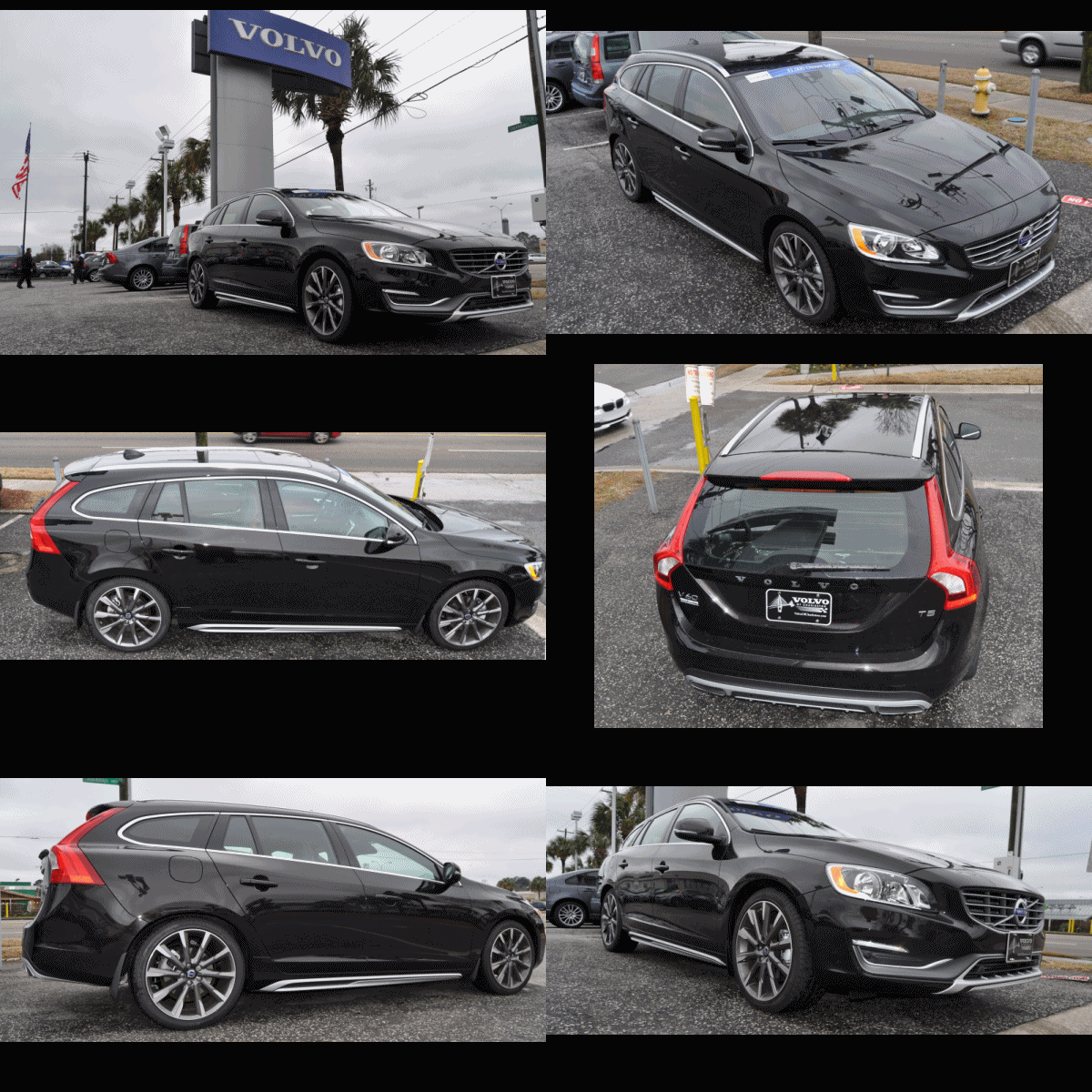
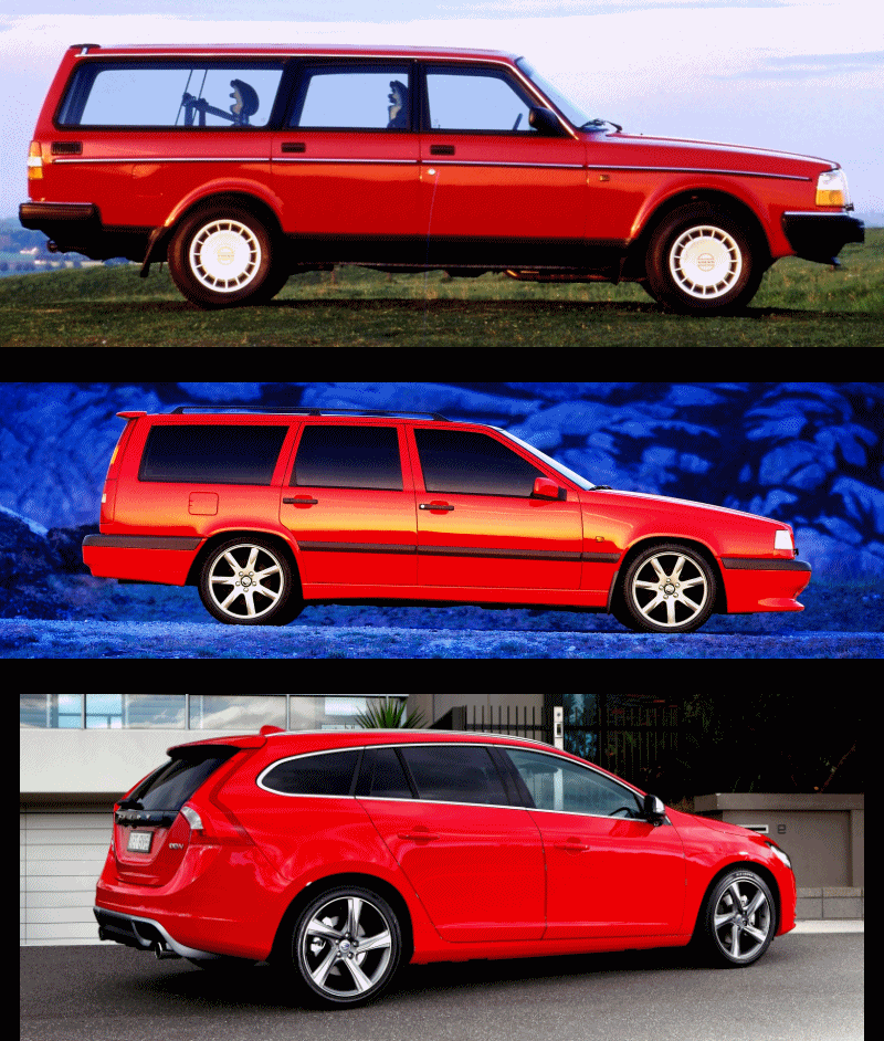
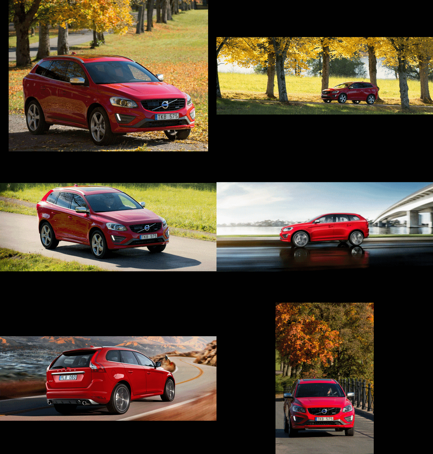
No, it is the opposite. This Volvo style is already appearing on American roads with the V60. From there, the only way is UP!
Congrats to Volvo! I have a huge photo of Ingelath somewhere, but this article is long enough already:)
Official Details from Volvo below ahead of the Concept Estate’s glitzy reveal next week in Switzerland.
DESIGN AND TECHNOLOGY AT HEART OF VOLVO CAR GROUP’S NEW IN-CAR EXPERIENCE
Sleek Scandinavian design and intuitive technology to reinvent the car interior
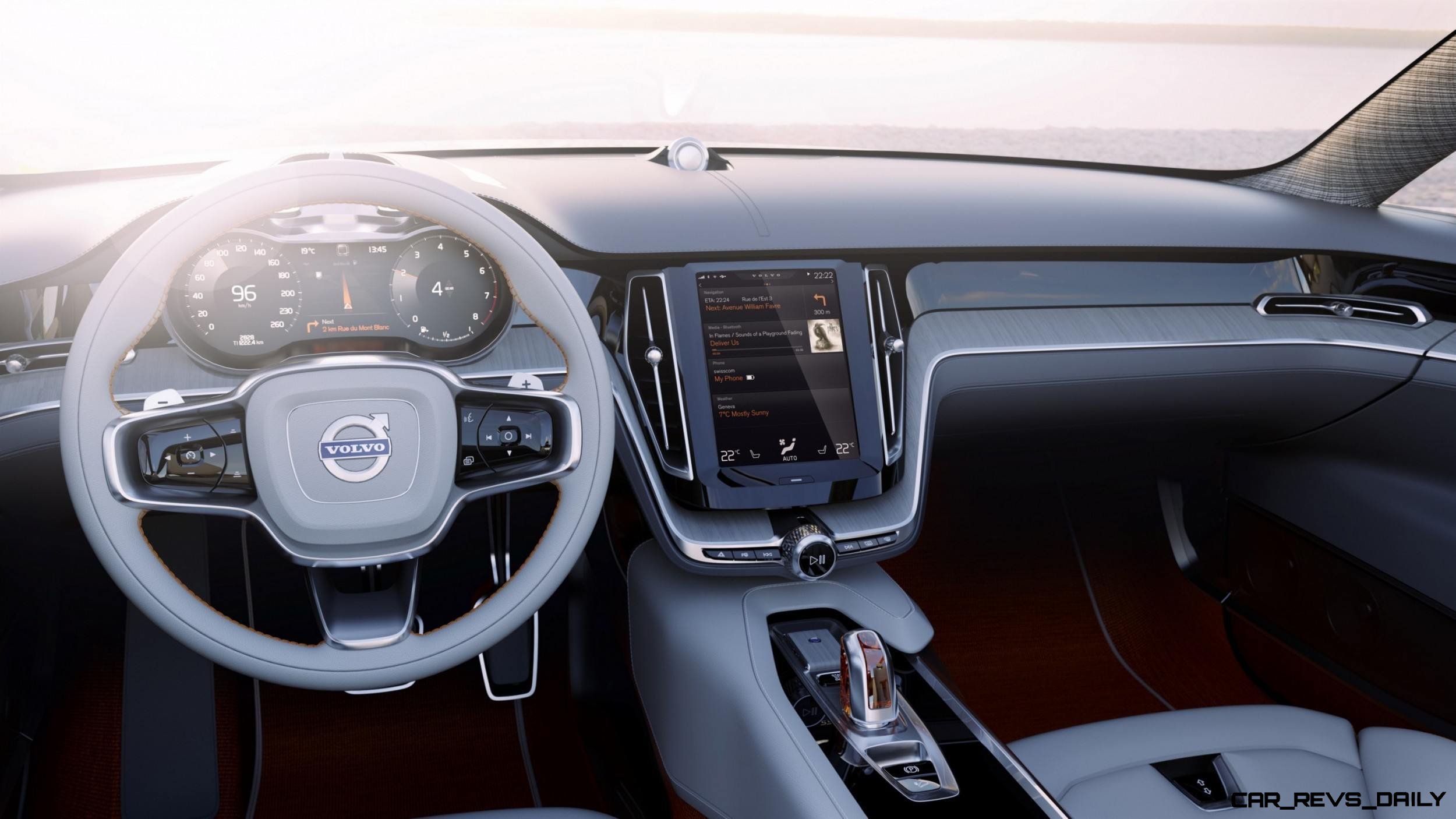
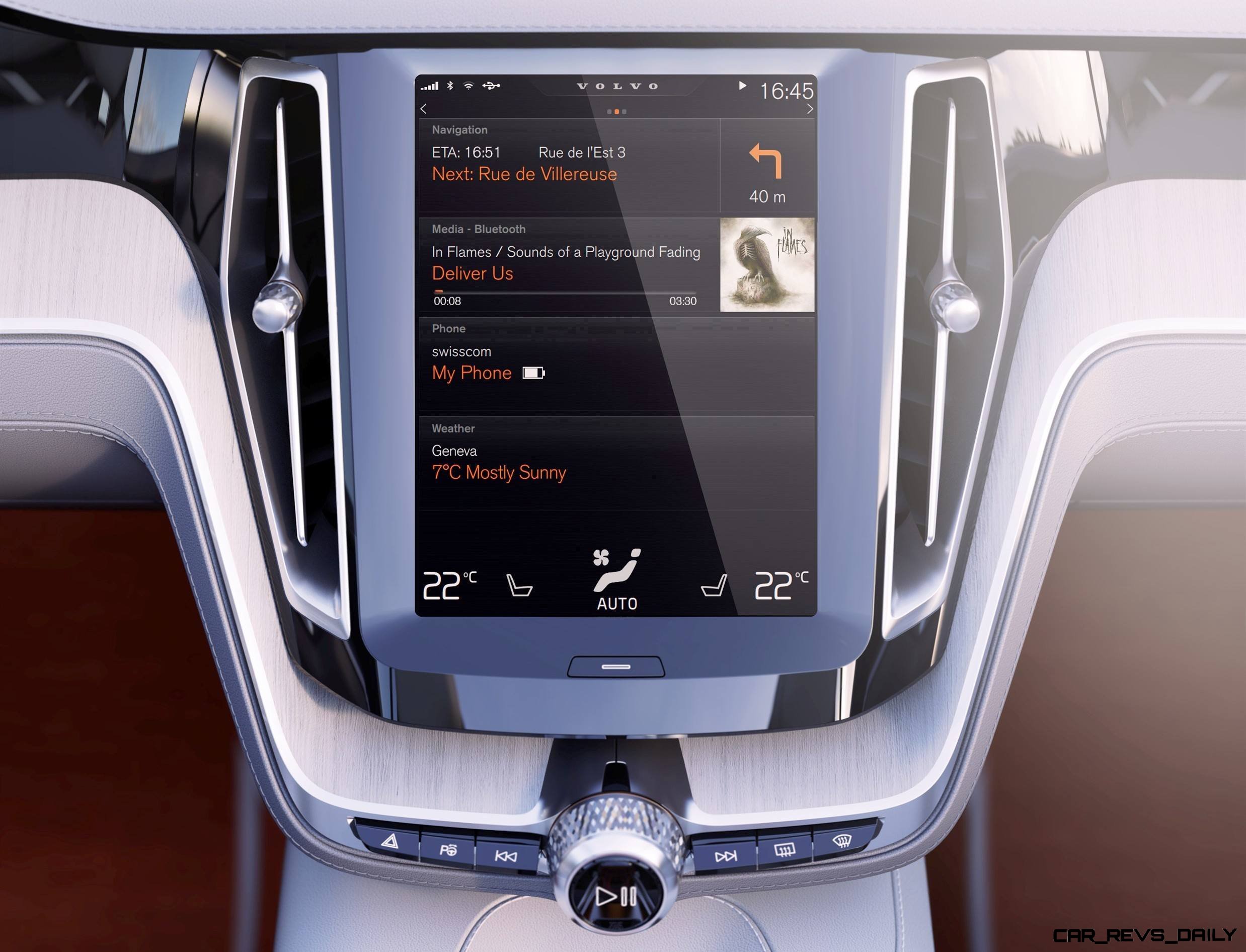
ROCKLEIGH, N.J. (Feb. 27, 2014) – Volvo Car Group will use the Geneva Motor Show to reveal its new in-car control system, which is designed around a large tablet-like touch screen that will simplify and enhance the way drivers operate their cars.
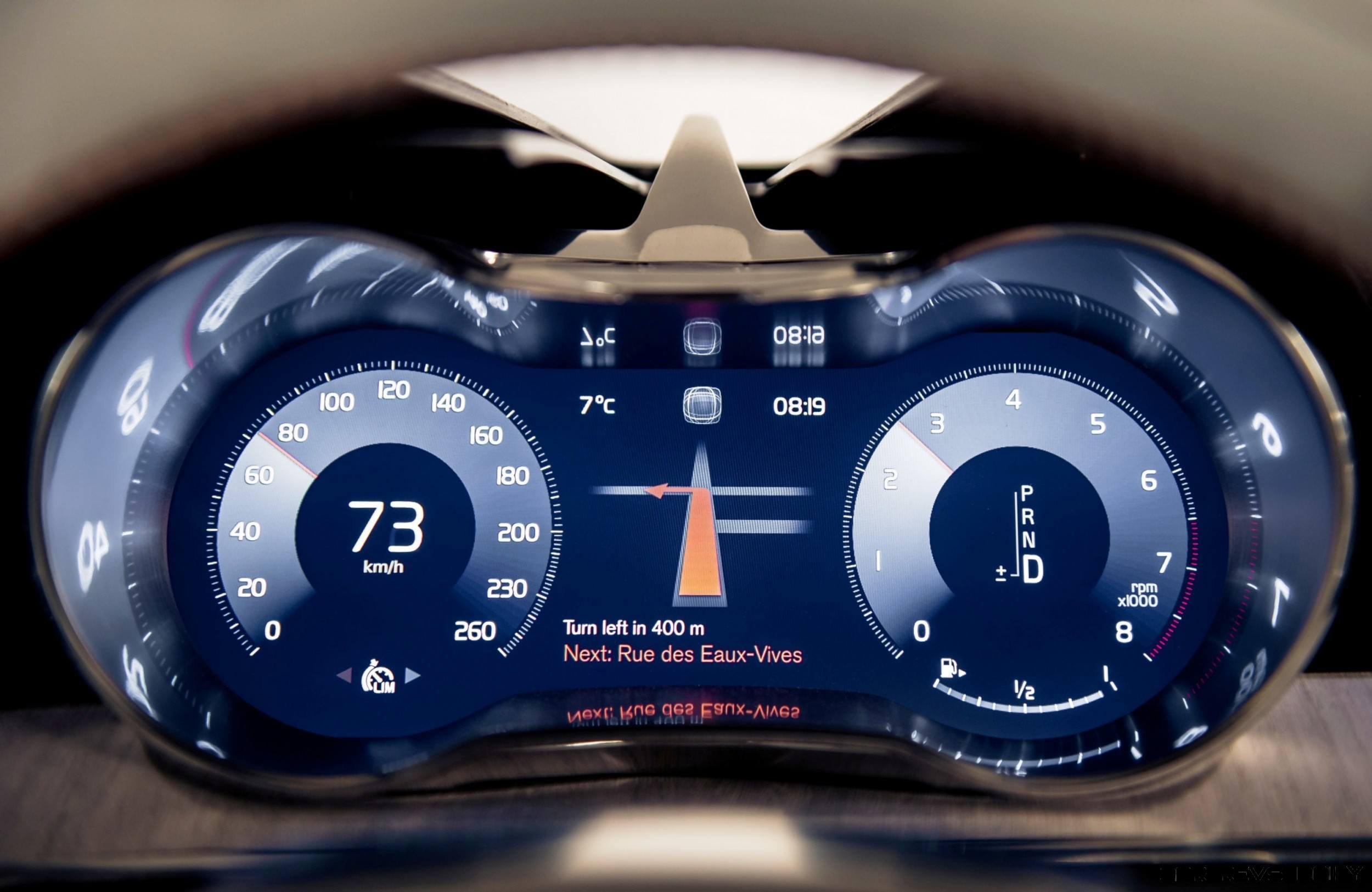
The touch screen replaces the traditional selection of buttons and controls in the center stack with one clean and sleek control panel. It will blend established tablet functionality, such as swiping and pinching, with new solutions that are specially designed for the in-car environment. It also interacts with the digital instrument cluster in front of the driver.
“The basic idea is to organize controls and information in a perfectly intuitive and user-friendly way. Everything is exactly where you expect it to be, making the drive more enjoyable, efficient, and safe,” says Thomas Ingenlath, senior vice president design at Volvo Car Group.
This groundbreaking driver experience will be introduced in the next car generation, starting with the all-new Volvo XC90 later in 2014.
“The new user interface is designed to create a smooth, logical and safe interaction between the driver and the car,” says Ingenlath. “This goes far beyond just putting a large tablet in the center of the dashboard. We have created a digital environment that is fully integrated in the car.”
Logical stack of four ‘tiles’
The layout on the portrait screen can be described as a stack of flexible “tiles,” each displaying a key functionality. Navigation is on the top, followed by media and telephone.
A thin notification band is located above the tiles, while the digital climate controls become the foundation of the pile.
“Information, navigation and media are high up and easy to keep an eye on. The phone controls, application icons and climate controls are located low, comfortable to reach and touch. Using the screen is so logical that it will be part of your muscle memory very quickly,” explains Ingenlath.
The smooth user interface also includes thumb-reach controls on the steering wheel and extensive voice-control possibilities.
Digital solution
The new user interface is designed so that the tiles on the touch screen expand on interaction. When one of the tiles expands to display required information, the others are compressed, still visible and instantly accessible.
“Having all functions present all the time makes the touch screen exceptionally user-friendly. The spacious layout also promotes smooth interaction without distraction,” says Ingenlath.
Crystal clear but calm
“Creating this crystal clear, yet calm, environment is a core part of our digital craftsmanship. It is fine for an ordinary tablet to fight for your full attention but a touch screen in a car is very different. Information must be clear and user-friendly, without turning up the visual volume so much that you risk losing focus on the road. This also makes it easier to make really urgent information, such as a warning, much more distinctive,” concludes Ingenlath.

Tom Burkart is the founder and managing editor of Car-Revs-Daily.com, an innovative and rapidly-expanding automotive news magazine.
He holds a Journalism JBA degree from the University of Wisconsin – Madison. Tom currently resides in Charleston, South Carolina with his two amazing dogs, Drake and Tank.
Mr. Burkart is available for all questions and concerns by email Tom(at)car-revs-daily.com.

